the Mind Machine Files

welcome to the Mind Machine files. Feel free to engage with any of the posts, where possible. Also, check back regularly to see the latest updates. A reminder, that what you see today, might not be the same tomorrow, as this page will be ever changing.

the story so far...

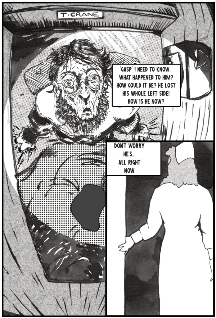
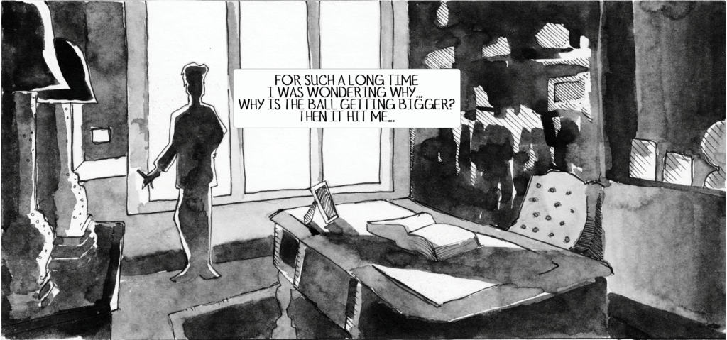
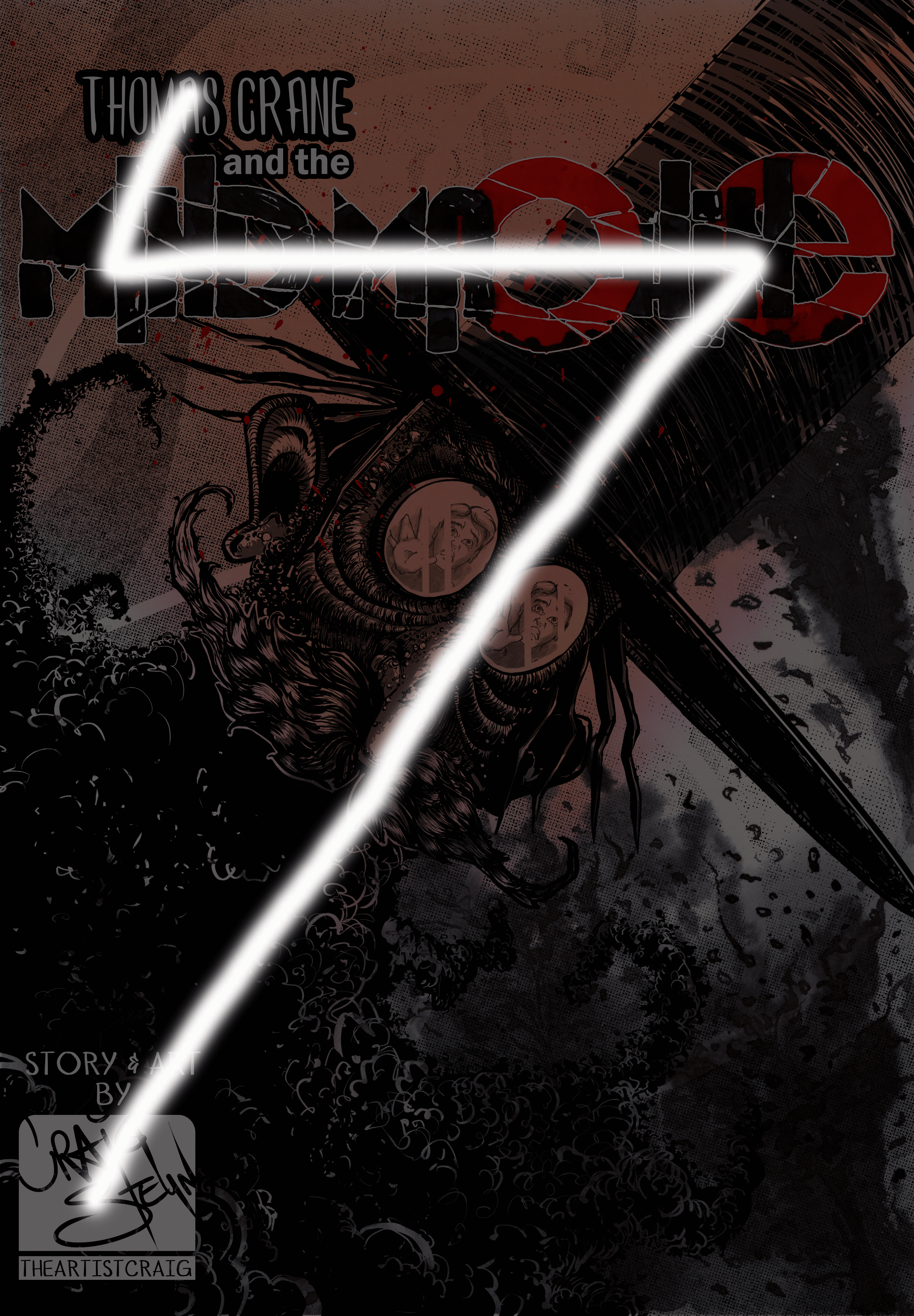
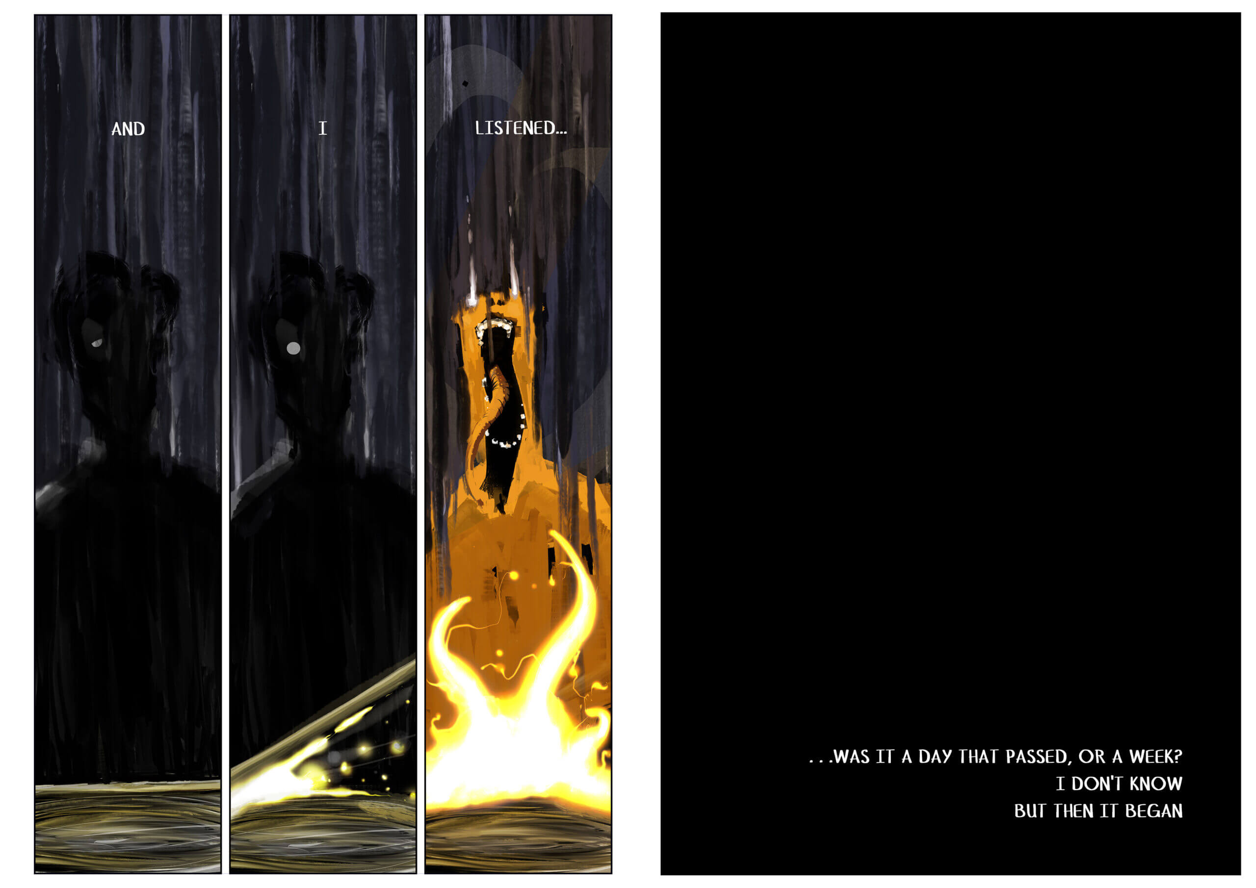
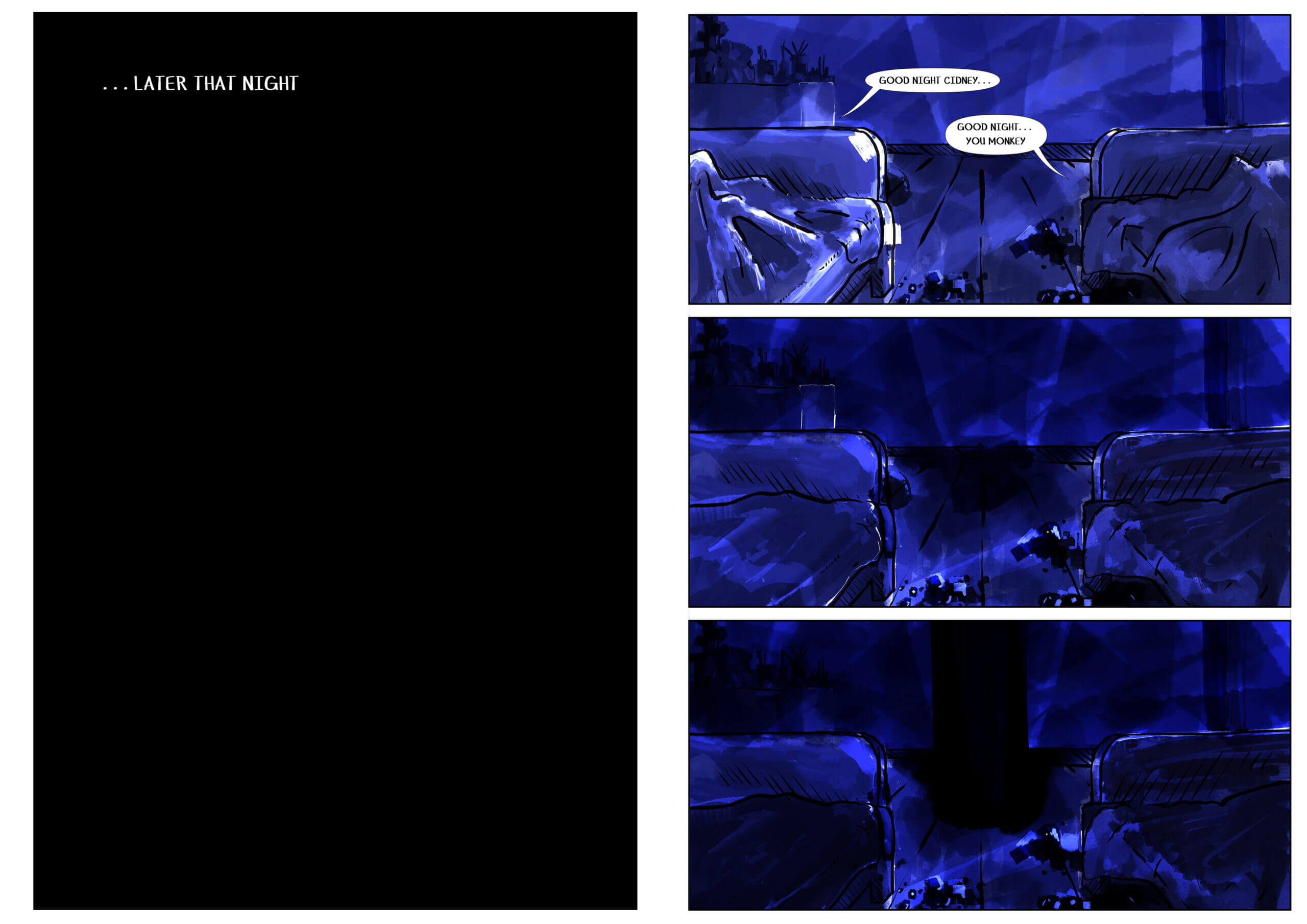
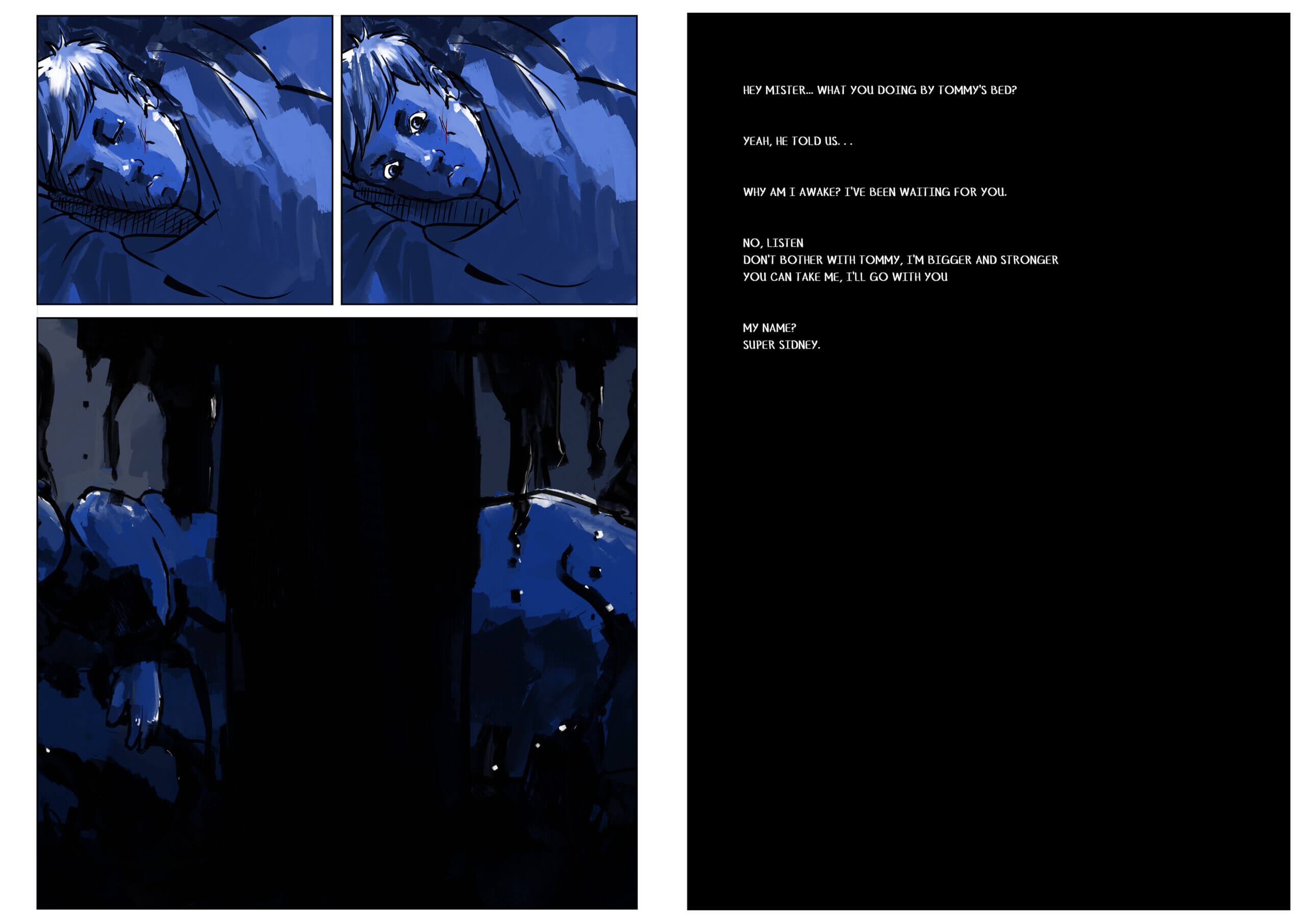
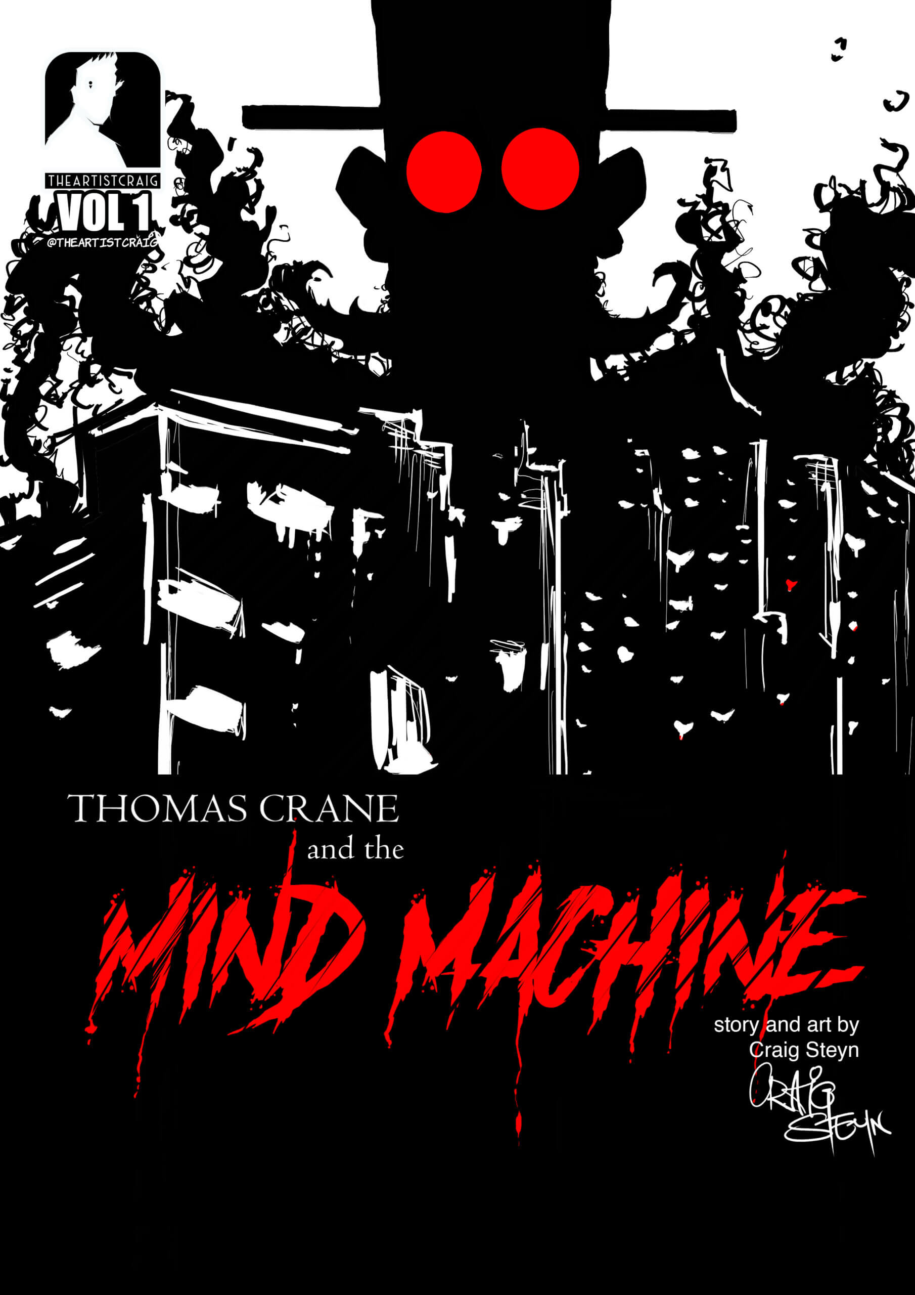
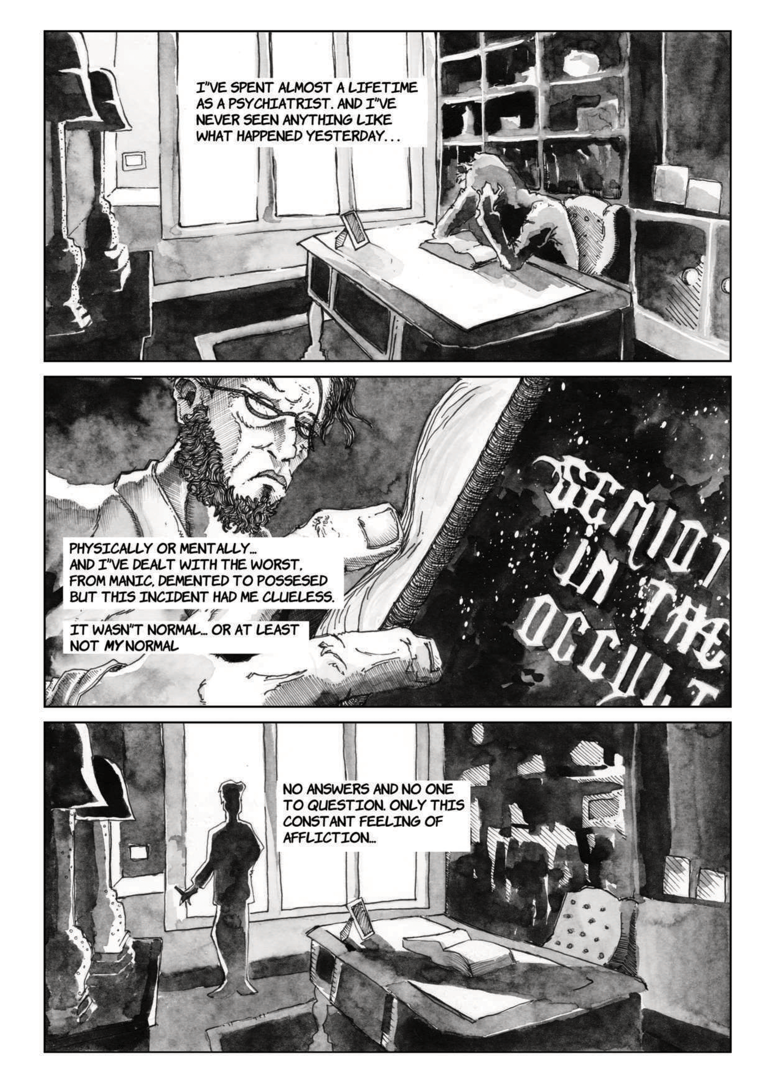
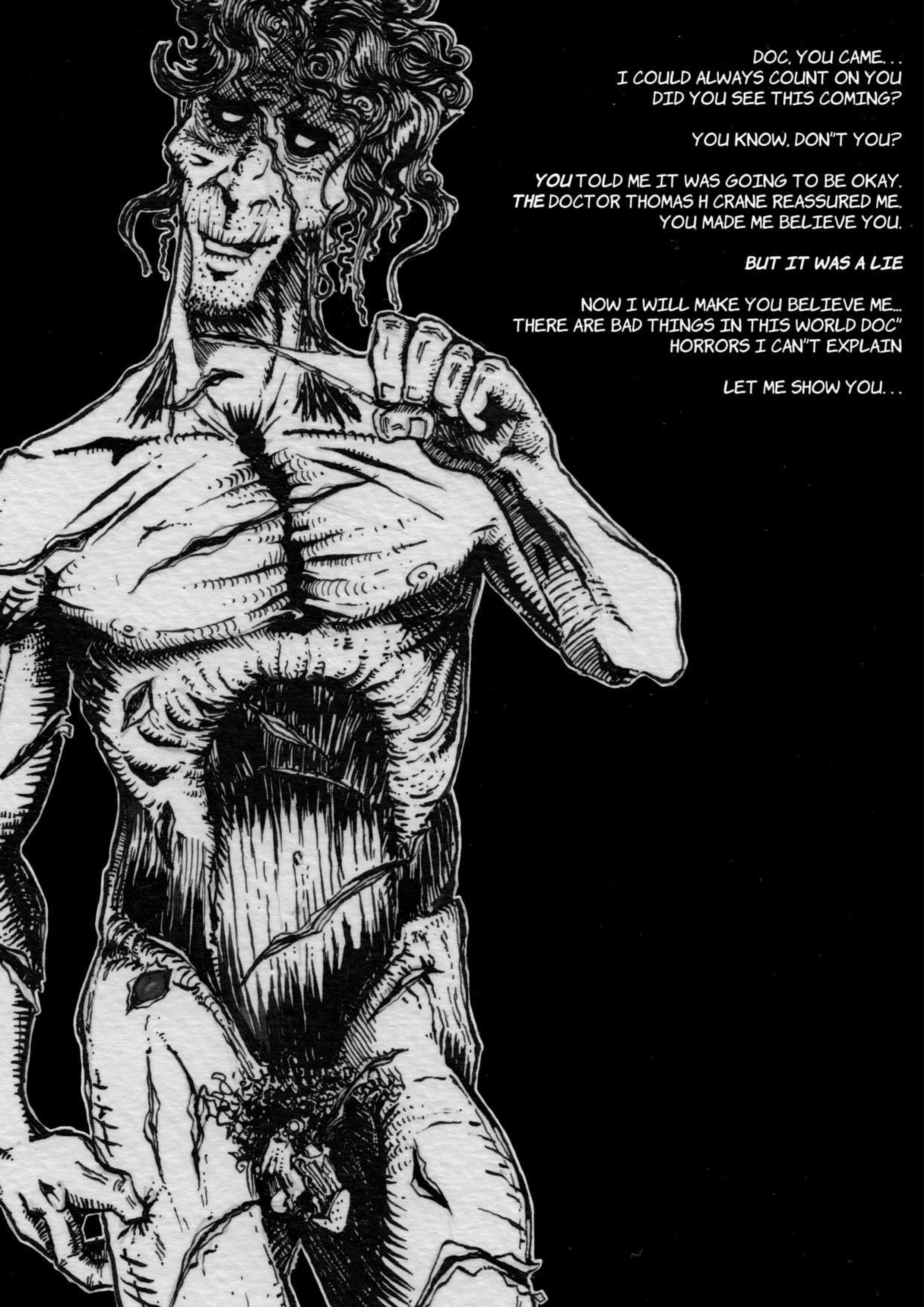
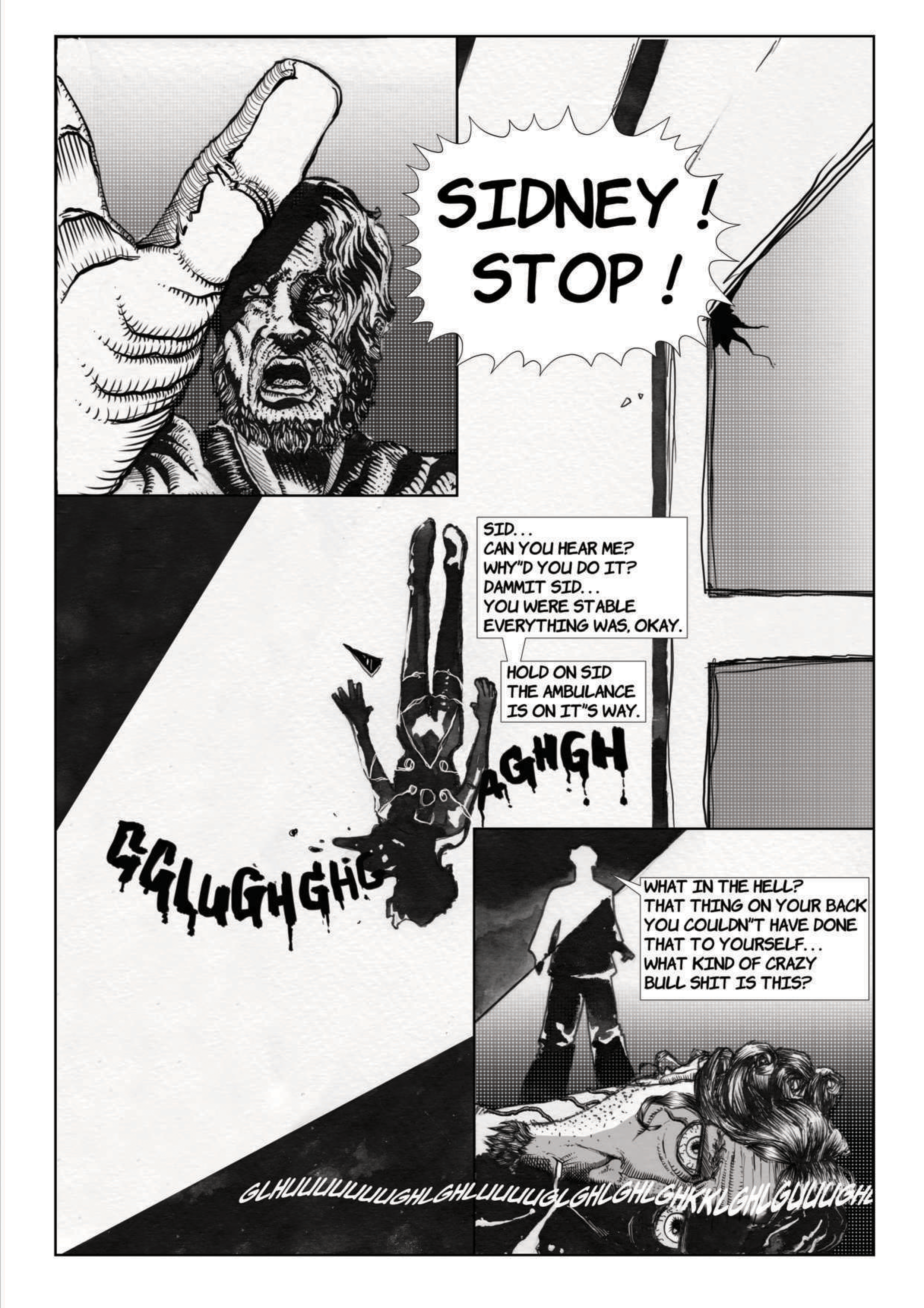
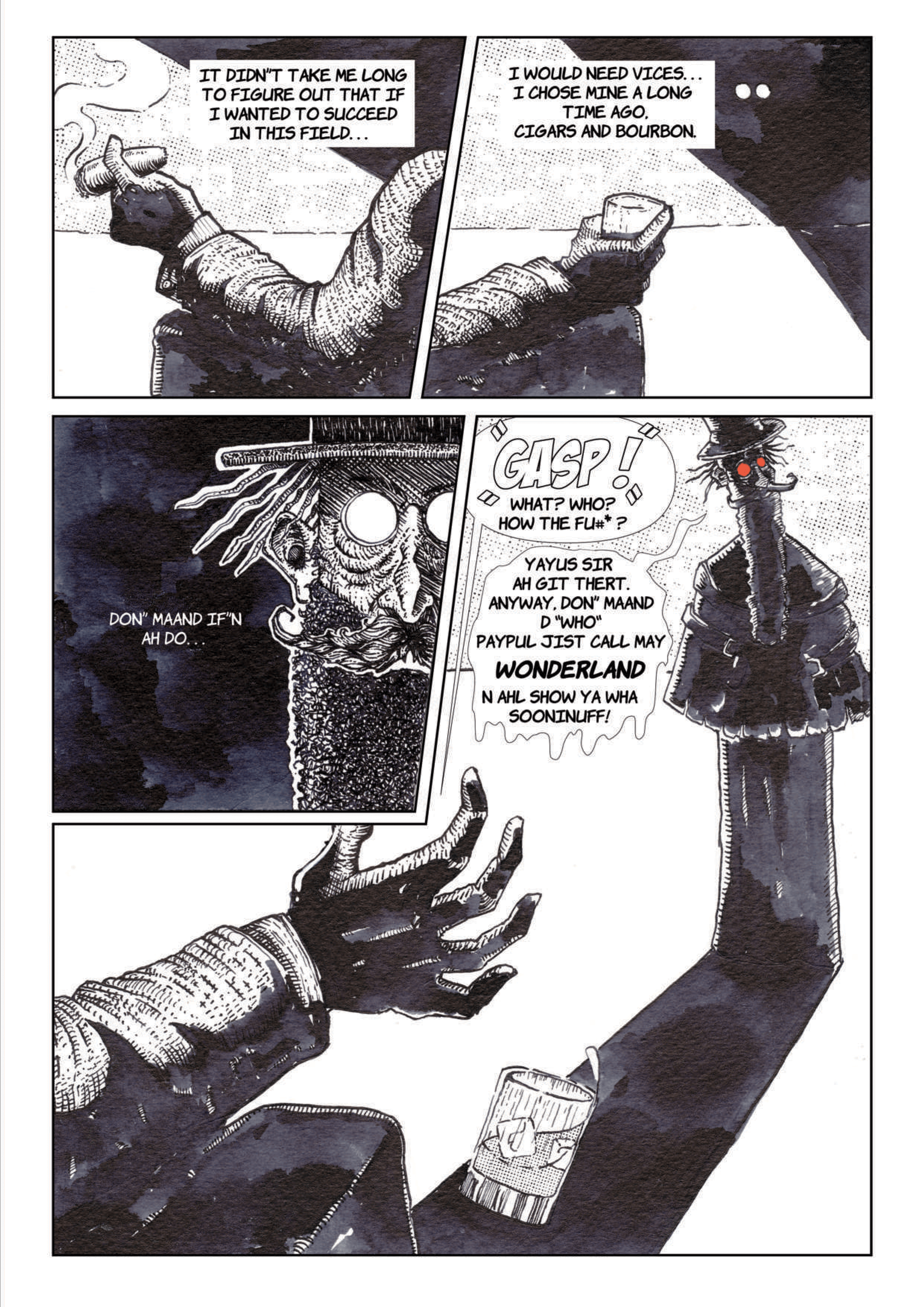
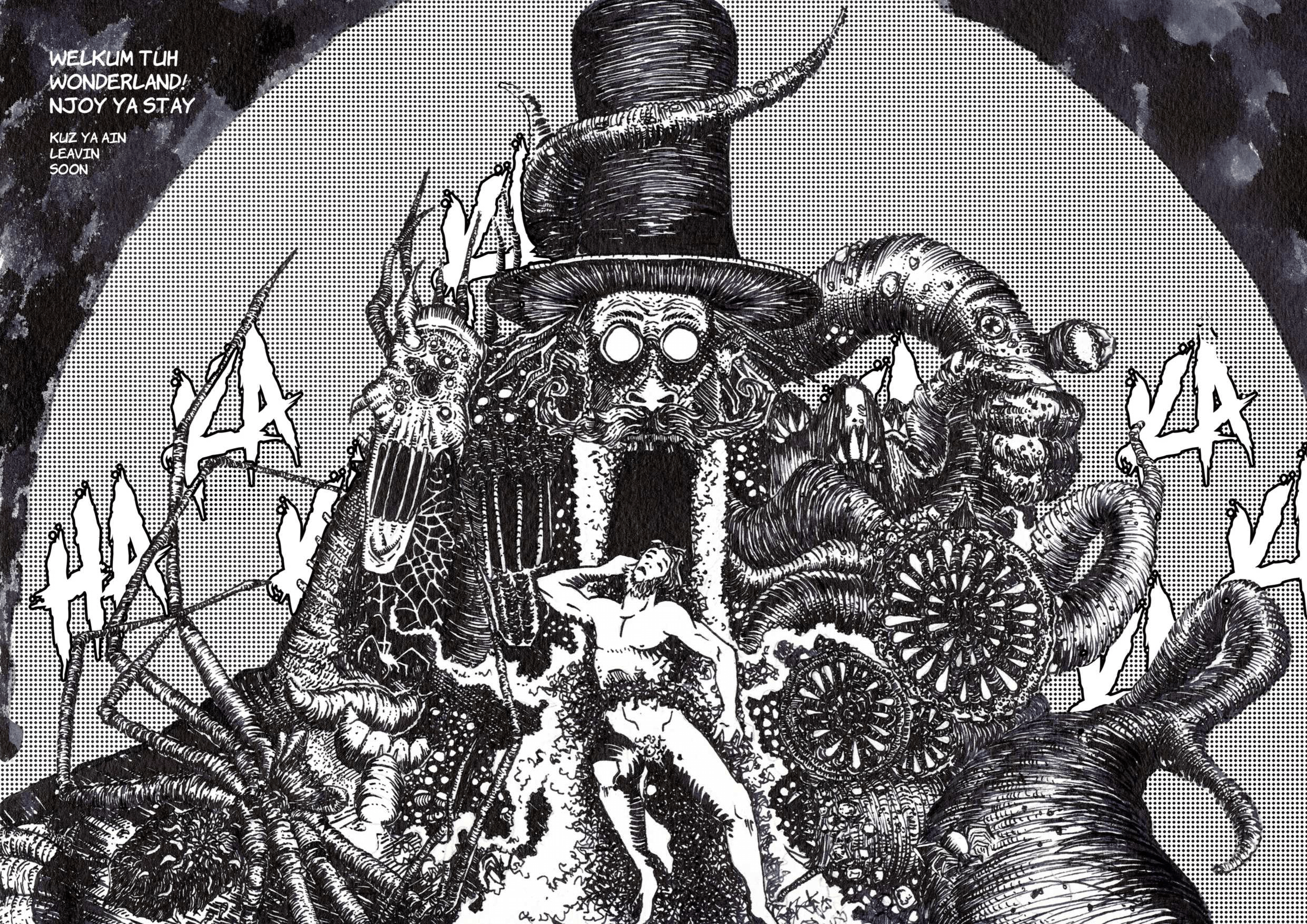
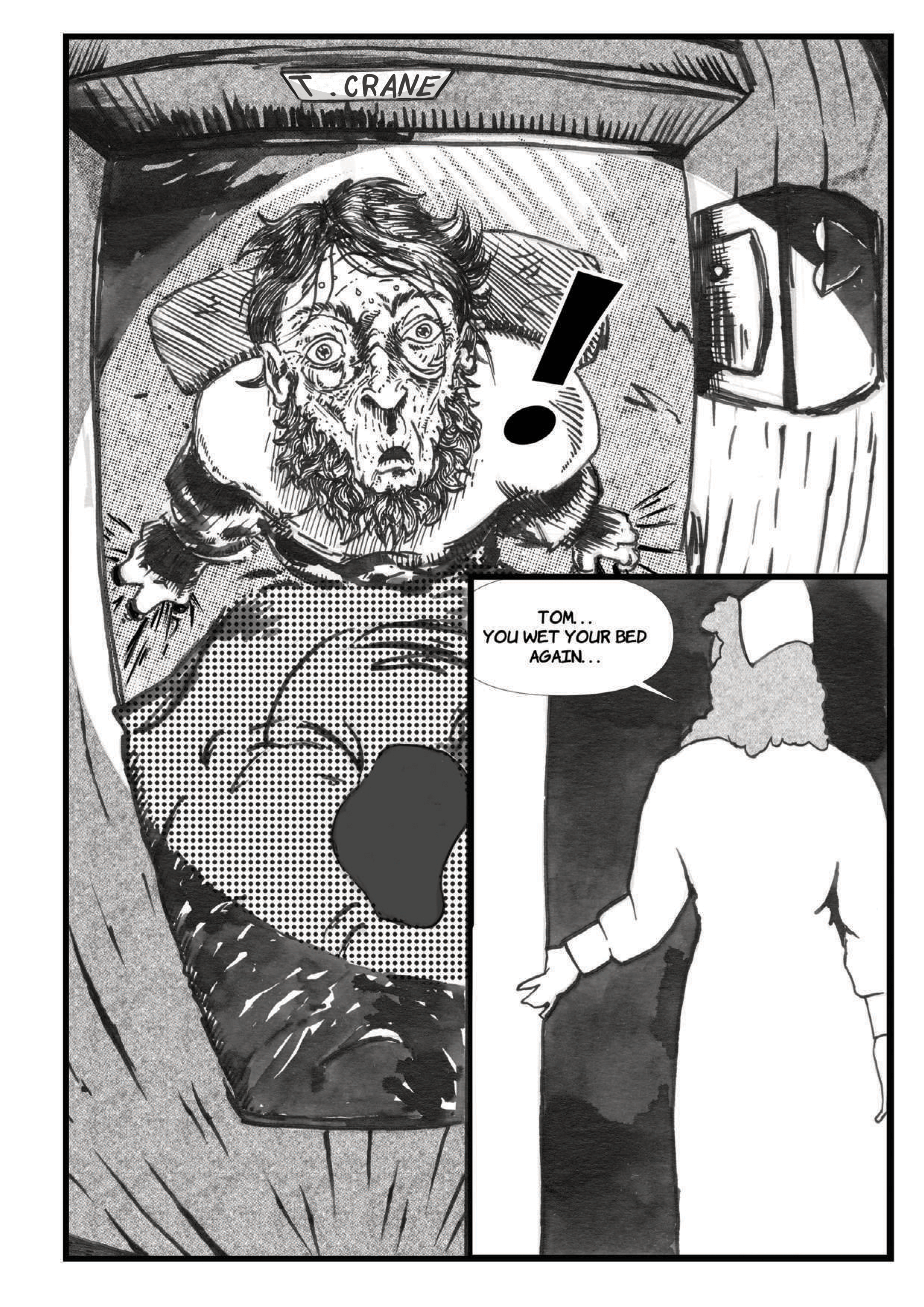
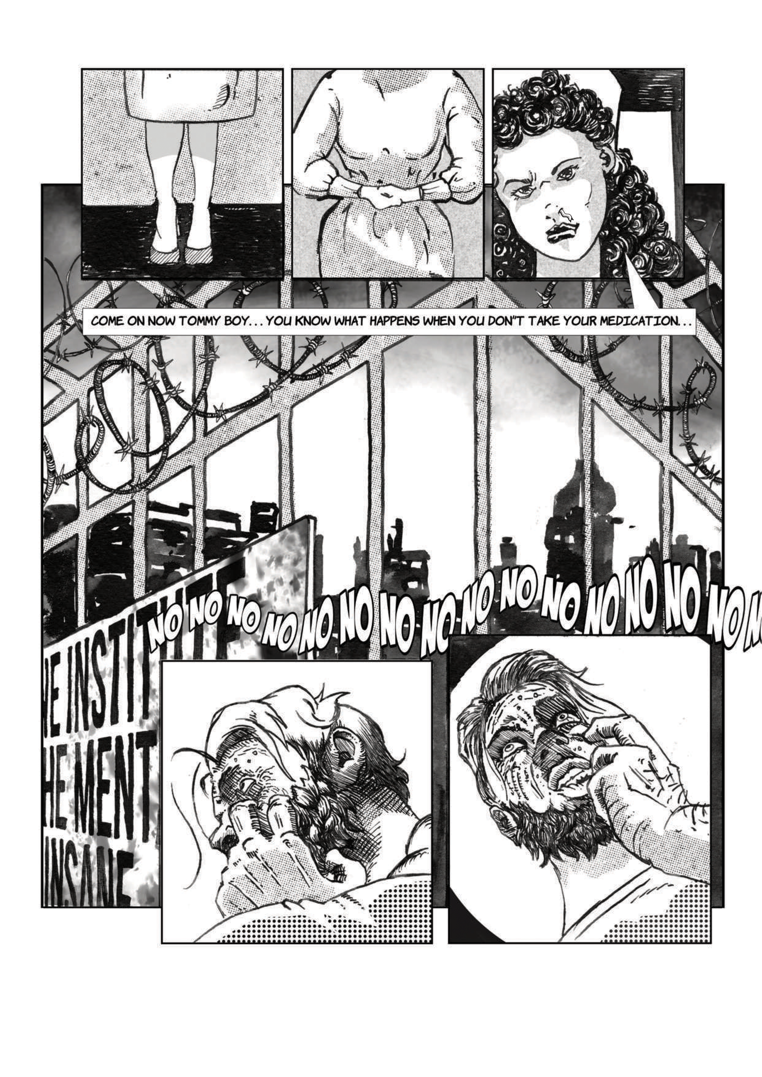
Below are the first nine pages of Thomas Crane and the Mind Machine. Click on the image titled “cover” maximize the screen and use the arrows to navigate through the pages. This is a version 1.2 copy with edits made to it after receiving feedback from my lecturer. 

the video diaries

The purpose of these videos are for them to act somewhat, as diary entries. Although this information can be written down, I feel a lot of information can be missed due to retyping, scratching out or just feeling like it’s silly. In capturing it on video it becomes an instant entry that I can question later. I also feel there is a different kind of reflection when talking and verbalising your thoughts. At times there will be other people in the videos with whom I discuss certain things. This also gives me the opportunity to gain a different perspective, other than my own. My intention is to leave these videos as unedited as possible, only information that does not pertain to volume two will be removed. They will also pop up anywhere throughout the website next to the video diary icon.

Some initial thoughts and expectations

discussion with my wife on her thoughts

some fears and reflections on MM1

Another important reason for the videos are for me to go back and question myself. Through this process I’m hoping to refine my thoughts and build on my concept. Almost as if I’m having a conversation with myself. Other aspects that will influence the outcome of the final product will also be added, possible workbook entries and research.

This web page will change as information is added and will grow as the information is compiled. New sections will be added and the structure might re arranged, but it will remain live at all times. 

Reflections

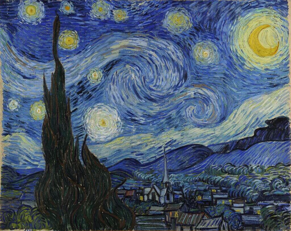
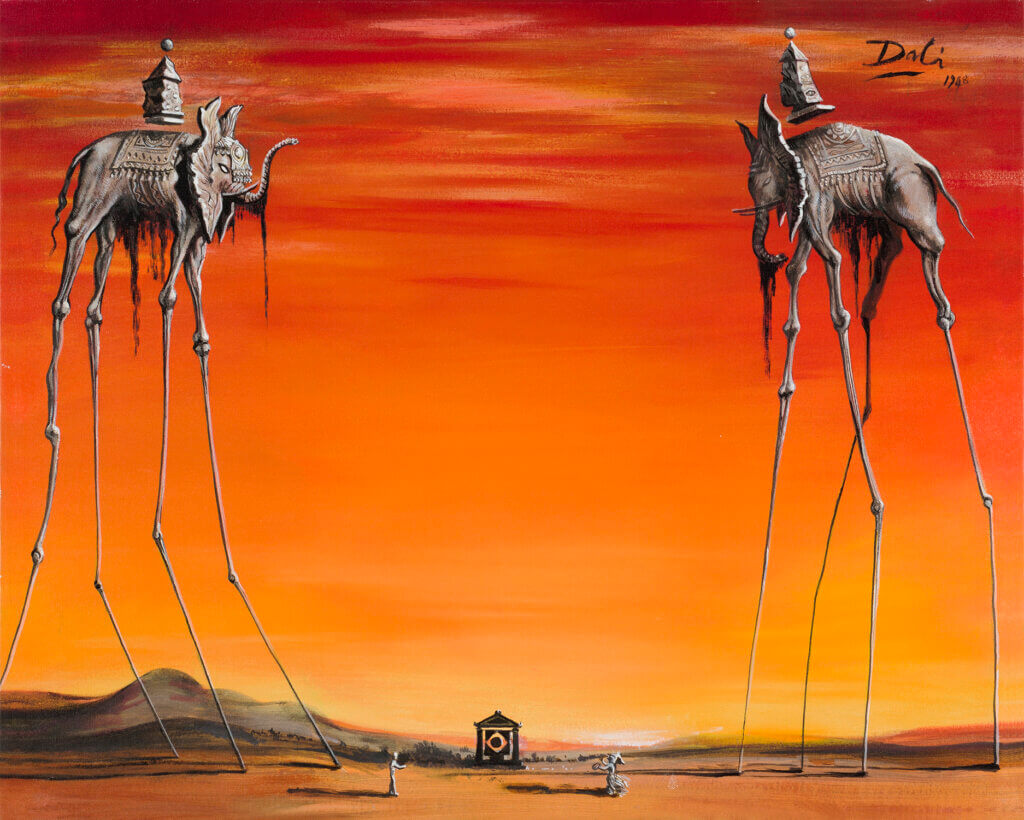
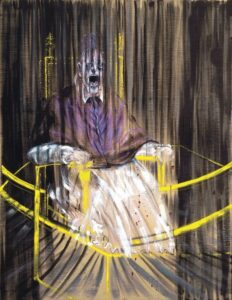
work i want to reference

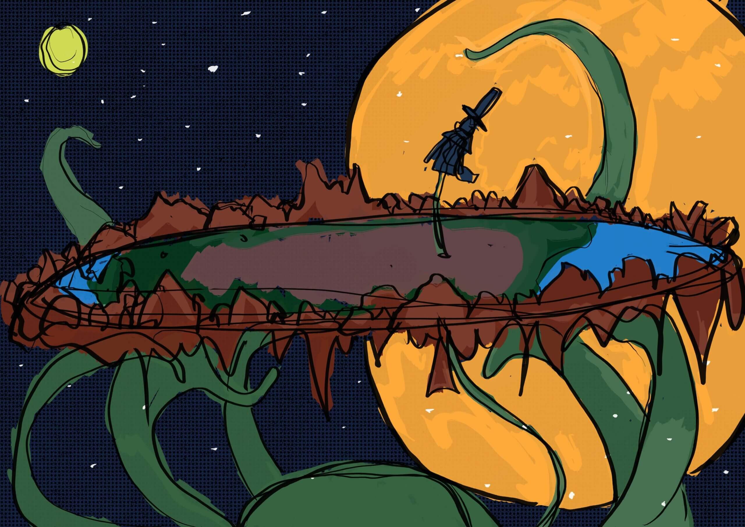
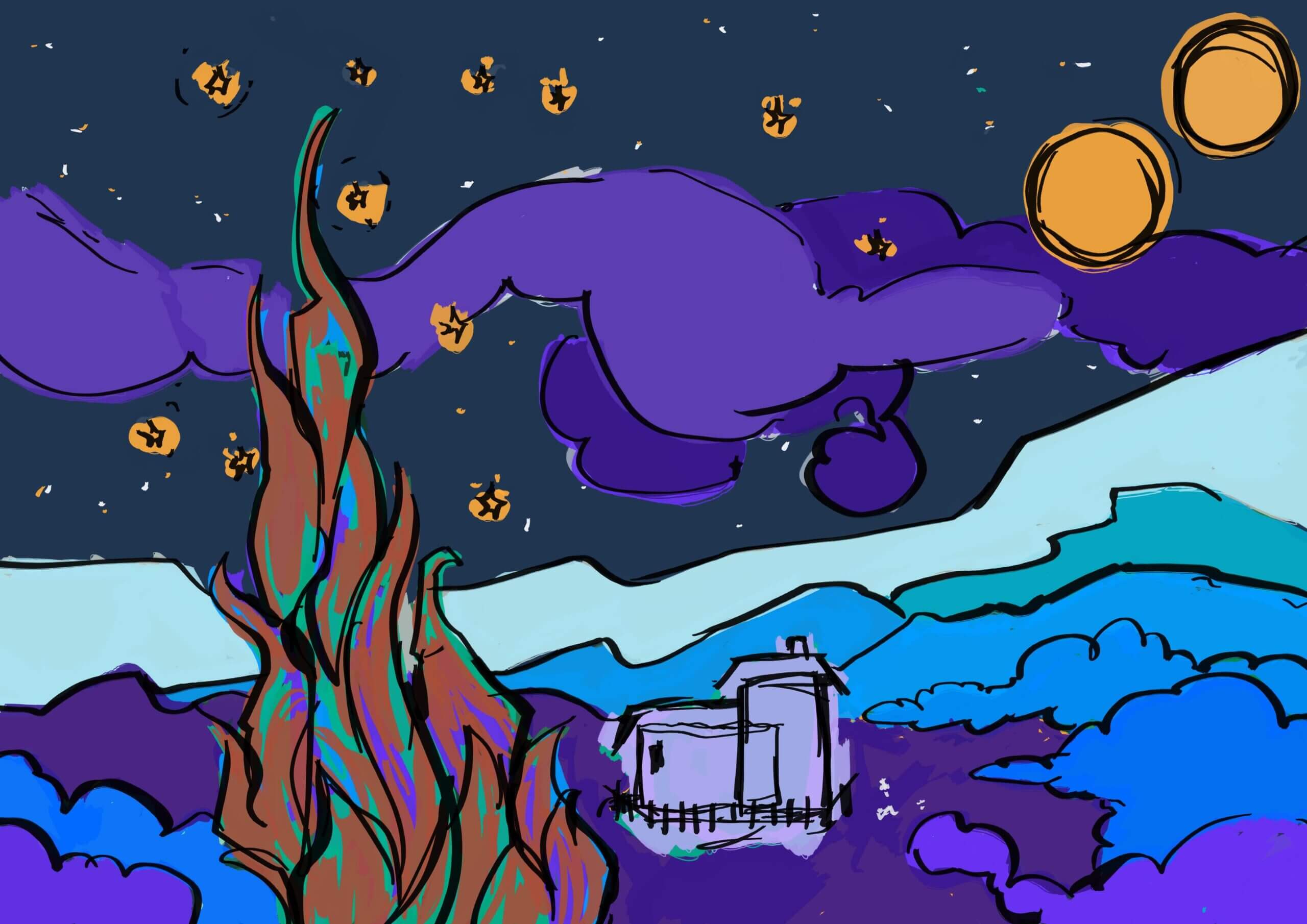
Vincent van Gogh 1889 Starry Night
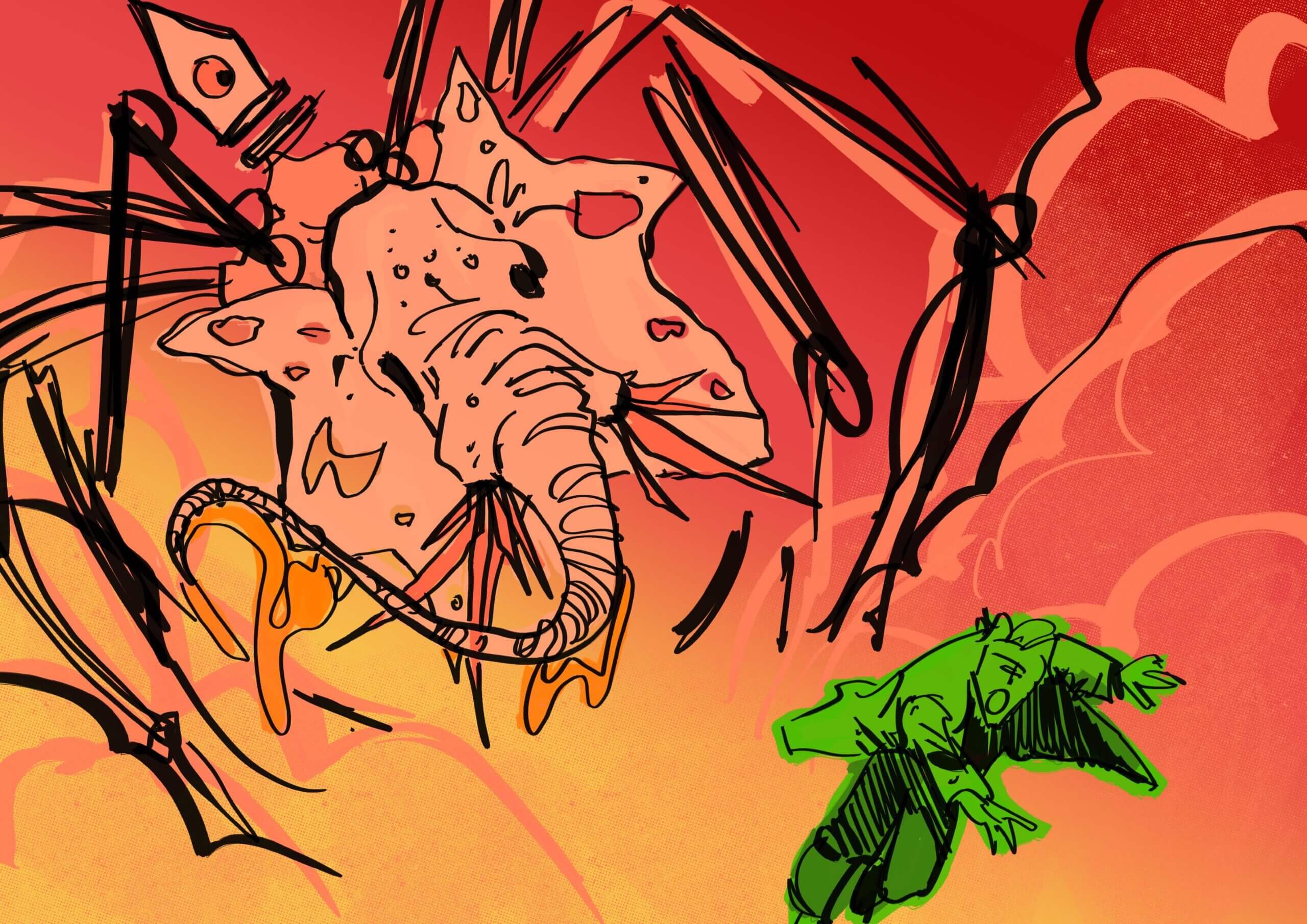
Salvador Dali 1948 The Elephants
Francis Bacon 1953 “Study After Velázquez’s Portrait of Pope Innocent X”
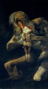
Francisco Goya 1819-1823 Saturn Devouring His Son

WORKBOOK

fONT CHANGES...

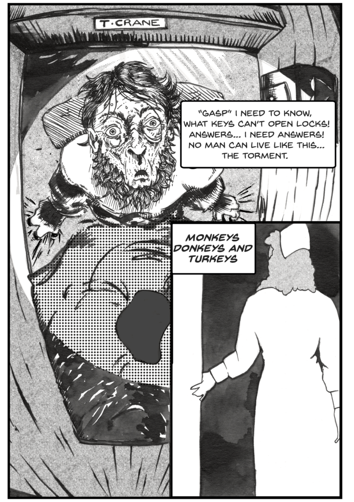
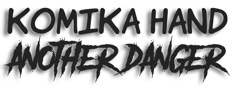
The first two things I want to change, is the font for the text and the font for the title. The reason for this is because the font for the text, komika hand, is a comic book font. Although it works fine, it’s a downloaded font, the same with the title. I think I could create my own font or find one that is better suited for the atmosphere of the novel.

The first thing I think I should do, is research if there are any other fonts that traditionally get used and why? Narrow down a few of the fonts that I like and see how they stack up against what I’m looking for. Initially I thought to go with a typewriter styled font, as can be seen on the black pages of vol. 1.2 but, the problem is, how much lettering can I put in one speech bubble? Is it going to be a serif vs a sans-serif vs script vs speciality? And then, am I going to try and create my own font or not?
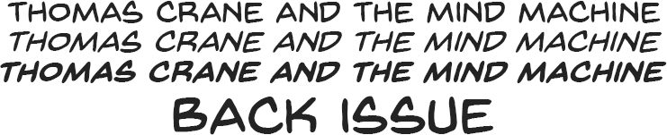
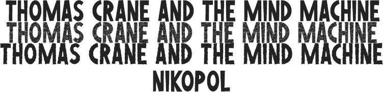
After taking a look at several fonts, these were the three that seemed to convey a bit more of a serious tone. All sans-serif fonts and possibly specialty fonts. What I like about Back Issue is it’s likeness to traditional hand lettering, the same goes for Sequentialist but, the longer letters feel stronger and more mature than Back Issue. Then there’s Nikopol, I like the thickness of the letters and I think it can work well with my art style. One thing that I’ve noticed throughout all of these fonts, as apposed to Komika Hand  which I had used originally, is that the other fonts don’t have that slight lean to the front. This is probably what I will emulate if I can create a font. Considering that Sequentialist is the font I’m looking at and it costs 25usd.

In the examples I can see both texts have their strengths and weaknesses. I would have liked to have tested Sequential however, it is what it is. Nikopol does come across quite strong in terms of aesthetics, but I feel it’s a bit too hard to read. Whereas Back Issue is much easier to read because of the letter sizes, it just feels weaker for me. The problem with the bold version is that it’s in italics and that’s exactly what I’m trying to move away from. At this point I think I’ll be trying to create a font that is a mix between the two. With the next step being… how do I create my own font.

Using this video as a base for the development of my font, the following is necessary:

  • outline a brief
  • visualise
  • build it out
  • refine characters
  • package and export

The video clip contains a lot of in depth information but, I think that’s a bit too much for the font I want to create and for the purpose I want to create it. So my plan going forward is to first test out a couple of font creation websites, however ther are some principles I will keep in mind when creating my font. The first thing I’m going to do is mess around on paper a bit and see if there is something that I like. After that I will use the caligraphr website and upload a rough of the font and see how it looks on screen, if I like it I will vectorise it in Illustrator and export it from there as a font. So from this point I will be working form the second bullet point outlined in the video. The biggest reason I don’t want to be so formal with the font creation is because I still want something that looks or at least feels natural with regards to hand writing.
rough lettering...

I mostly used a rectangular shaped font. Fonts that stood out for me are on pages 2 and 6. From here I need to extract them and vectorise them. I might increase their sizes and use them as templates to create a cleaner version that I can image trace in Illustrator, this will also give the opportunity to make small tweaks an add more character to the fonts.

This is just a short video on the process I used to extract the rough font. Now I have a template for the font I want to vectorise, from here I could possibly draw over it digitally, enlarge each letter and image trace it in Illustrator or I could use the pen tool and create vector shapes using bézier curves.  

So, at this point there is a question I’m unable to answer… “Does my font feel more mature?” I’m looking at it and it looks like what I want, but does it do what I want? The only way I can come to a conclusion on this is by doing further research. My initial research spoke about how to create a font, but not so much about font. If I can’t look at the font and explain why it does what I’m assuming it should be doing, then it probably isn’t doing that? The best possible solution would be to go back and do some research on fonts as a whole. By the end of this, I can re-evaluate what I’ve done so far and see if it makes sense according to what my goal is.
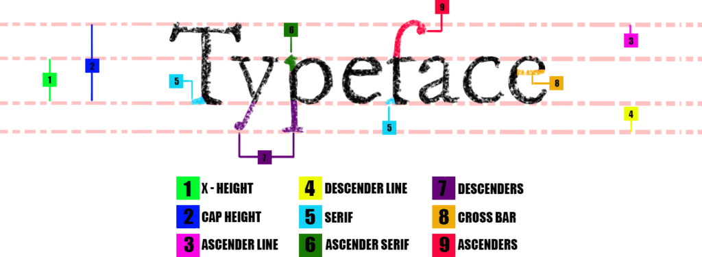
anatomy of a typeface

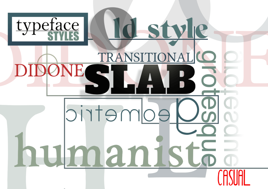
learning to identify typeface will most definitely help me understand what I’m looking at as well as determine what I want and why I want it there. After doing some research I found the various basic typeface families and how to distinguish between them. What was more significant though, was the reasons they were created. I think this will be a good aid in creating a font that accomplishes what I want it to. 

diagonal stress

vertical stress

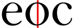
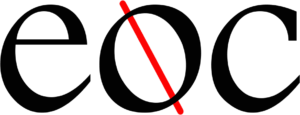
“the angle of inwards pressure inside the letter” this causes the difference in the stroke width in letters. Modern fonts have a vertical stress that cause the thin and thick lines to usually be opposite each other. Older fonts have this character at a diagonal angle. It can easily be identified by looking at the letters “e, o and c”. This is important to consider when creating my typeface. Modern typefaces will have a different feel than old typefaces and an older typeface could add more to the overall feel of the story.

After spending much needed time researching typeface’s in more depth and learning about what distinguishes the one from the other, I can confidently say that I’m able to identify the above fonts based on their characteristics. Serif, sans serif, stroke width, stress angle and character shape. These characteristics also identify what the typeface family is best suited for. keeping this in mind I should be able to best determine what characteristics my font should have.

Casual Script seems to be the most widely used font in comics and graphic novels. I think at this stage, if I can create such a font and vary the stroke width on certain letters with a vertical stress I can achieve the desired effect. I’m also pretty sure this font belongs to the grotesque family of fonts, I can explore them and see if there is one I could manipulate, if I find one that looks good for my purpose. This time I will focus more on using my dip pen and a number 9 script font tip.

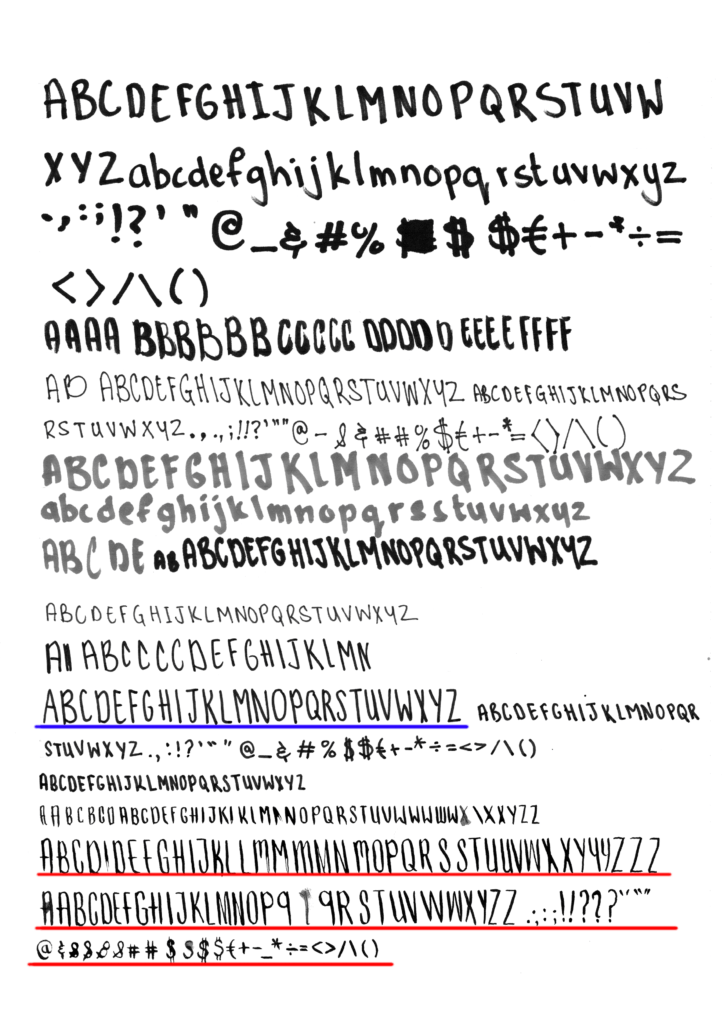
On this page I experimented with various nibs on water paint paper so I could see what different results I would get. The dipping pen nibs worked well for the line weights, especially the medium crow quill or inking nib. The RED underlined letters are a result of using it, and ultimately became the font that I chose to use. The thicker script writing nibs also worked well, but I couldn’t get the desired line weights with it. As for the brush nib, microns and the fine liner’s, the paper didn’t work so well with them. The ink makes a little round ball as soon as it touches the page, very undesirable. Although the micron 8 didn’t do this, the letters are too thin and no line weight, as can be seen with the BLUE underline. The chisel tip right on the end actually worked quite well, I could achieve a variation in line weight to a certain degree, I might go back and try it out again if I don’t get what I’m expecting to on the last font, which is looking pretty good.

With the RED underlined font I achieved a good variation in line weight as well as an overall good looking casual script. The vertical stress is evident and the font is definitely thinner. So in essence I’ve achieved everything I wanted in creating the font. The next step is to convert it to an OTF file and see how it stacks up against Komika Hand which I’m currently using. Off the top of my head though, I might have a problem with legibility when used at the standard size of 8pts. Unless I can get away with using it slightly bigger, because Komika Hand is quite geometric so it reads easier. And then there’s the question of the kerning, which I hope the software will deal with automatically.

It didn’t take me long to figure out that the font wont be legible at the standard size. In image 5 I increased the size of the font to see if it would make a difference, but it didn’t. From what I can see, the problems result from the line weights and letter shape. 

Going forward, the plan is to try and keep the letter shape and vertical stress and keep the line weight consistent. Probably only using the Micron pen or script nibs.
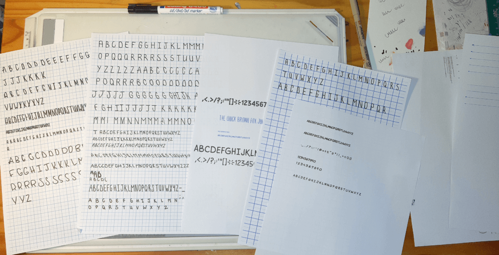
After many more samples, I came to the conclusion that I need to keep the glyphs geometric. I went back to the typeface that stood out for me in the start, Sequentialist. I then used it’s glyph measurements and applied it to my glyphs, I abandoned the notion of creating a thinner typeface, but I was able to get away with creating a slight variation in the line weights. The result is a font that is easily legible and more mature looking than komika hand because of it’s symmetry and shape. I also didn’t completely abandon the script font and will add it to the Casual Thomas family as Casual Thomas HS, a font to be used for headings because the shape contrasts well with Casual Thomas Regular.

CASUAL THOMAS HEADLINE SCRIPT

If you’re viewing from a mobile device, Casual Thomas might not load

CASUAL THOMAS HS SHOULDN’T BE USED SMALLER THAN THAT, HOWEVER CASUAL THOMAS REGULAR CAN BE VARIED!

Lorem ipsum dolor sit amet, consectetur adipiscing elit. Ut elit tellus, luctus nec ullamcorper mattis, pulvinar dapibus leo. 1234567890 !@#$%^&*()_+-=[];’./,{}:”<>? @20pts

Lorem ipsum dolor sit amet, consectetur adipiscing elit. Ut elit tellus, luctus nec ullamcorper mattis, pulvinar dapibus leo. 1234567890 !@#$%^&*()_+-=[];’./,{}:”<>? @14pts

Lorem ipsum dolor sit amet, consectetur adipiscing elit. Ut elit tellus, luctus nec ullamcorper mattis, pulvinar dapibus leo. 1234567890 !@#$%^&*()_+-=[];’./,{}:”<>? @14pts

Lorem ipsum dolor sit amet, consectetur adipiscing elit. Ut elit tellus, luctus nec ullamcorper mattis, pulvinar dapibus leo. 1234567890 !@#$%^&*()_+-=[];’./,{}:”<>? @14pts

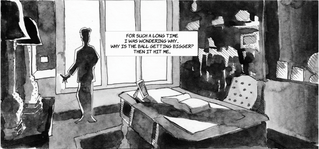
Above you can see the font at various point sizes from 20 to 8, which is usually the standard size for graphic novel speech bubbles. It also prints quite well and is in fact slightly larger than Komika Hand at the same size. I’m definitely happy with this.

Komika Hand at 8pts
Casual Thomas Regular at 8pts

these fonts are available for download. You can find the license agreement in the zip folder.

the title and cover

At the start I said I was going to replace the font for the title, but I’m going to do this in conjunction with the creation of the new cover. The idea is not to create a new typeface, but rather a text image.  The original cover was more an afterthought than an actual project, although it came together quite well, it could have been much better if I had taken the time to properly research what goes into the making of a good cover and I definitely want more multi media elements in it. I think a little gradient and distortion could have added tremendously to the eerie effect. Instead I went for hard lines and shapes with very contrasting colours. I grabbed a standard font, that even though it looks okay, harkens back to the days when Microsoft’s MS word typeface, Chiller, was spammed on everything. 

cover changes

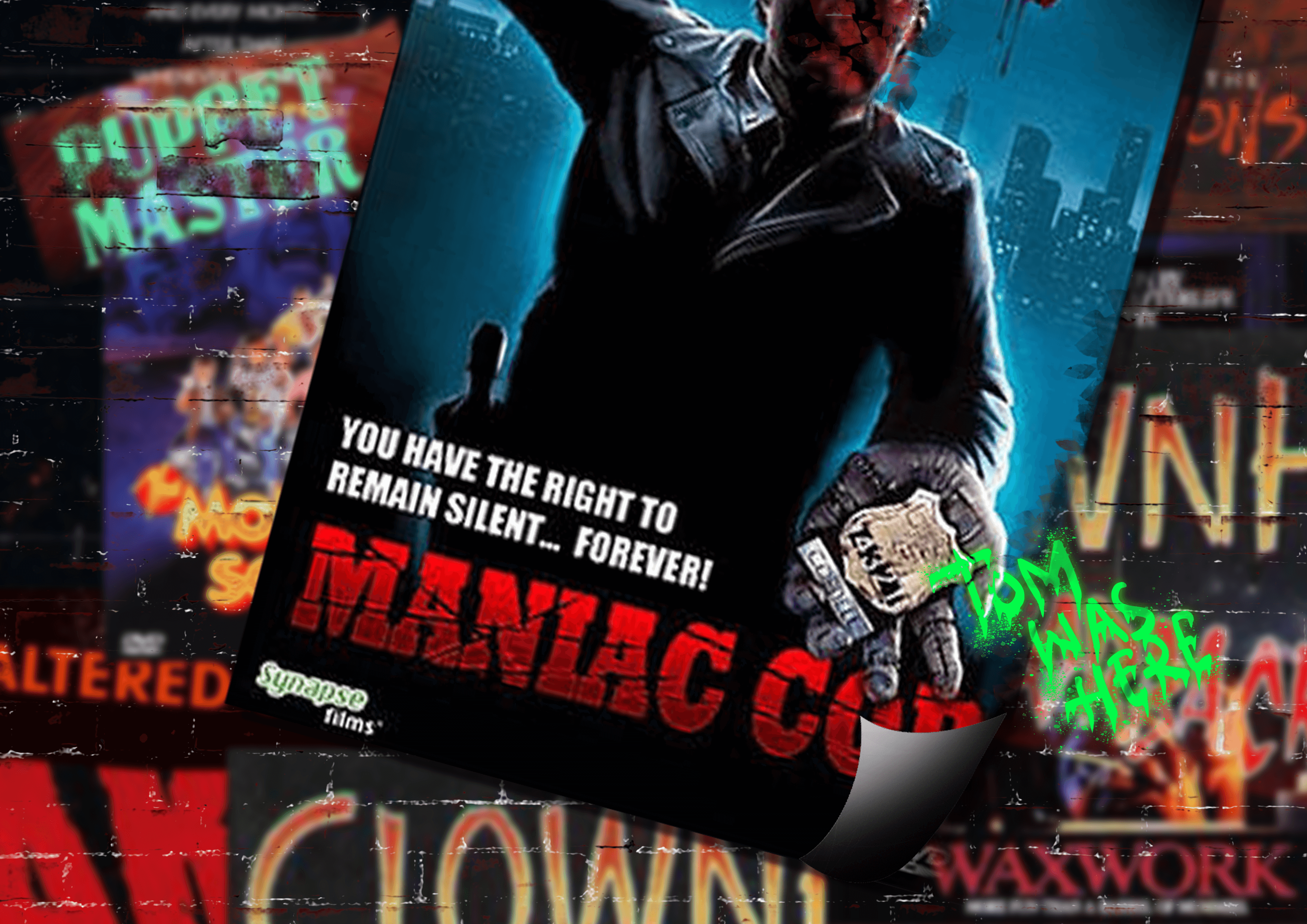
The intent of the previous cover was to show off two main subjects that came to the for in the novel, that’s Wonderland and this building. The purpose of adding the building was to give it a sense of being a character as well and not just a “building” later in the novel the building get’s revealed as an asylum, which is very important going into the second novel. What I intend on keeping from this cover is the colour pallet. Black and red contrast very well and considering that I’m building on the previous novel, it will be foolish to remove that identifying factor from Wonderland. Although I’m not looking to use the same device in this novel, I will try and tie the red in. And also, red means danger. Everything else will change. More experimentation and research is needed. I want the cover to be a piece of art in itself that depicts the mood I’m going for in the novel. It must also have a story in itself, that is pulled through the novel. The first place I’m going to start is… 80’s B-list movie posters, Why B-list? because often times the movie poster was better than the movie! Probably more a personal observation than fact, none the less, given the time period, they were an important part of marketing and should serve as some good reference and research material. 
cover art

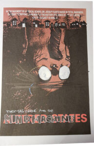
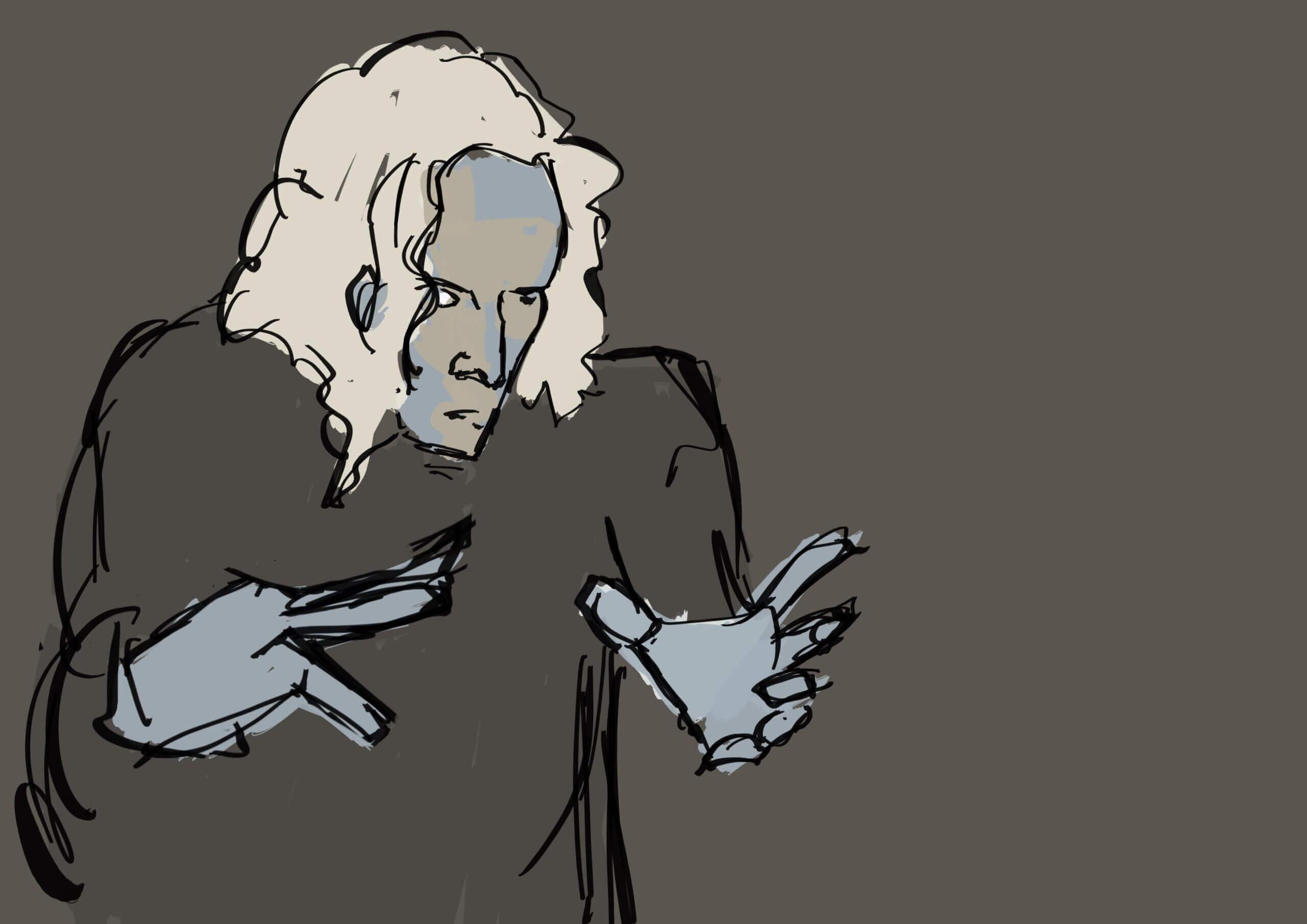
This poster caught my attention simply because of the upside down head. With the town at the top I get the sense that there is this character lurking in the roots of the town and affecting the residents of the town. I like the initial thought of it, but mostly because of how it looks. the story it tells though, is something different from what I want  it to tell. It takes the character Wonderland, and puts him in this position where it seems like his terrorising a whole town. The story of Wonderland and Thomas Crane is more personal than that and although I haven’t completed the story yet, there must be a connection made between Wonderland and the person he is “haunting”… 

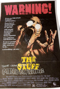
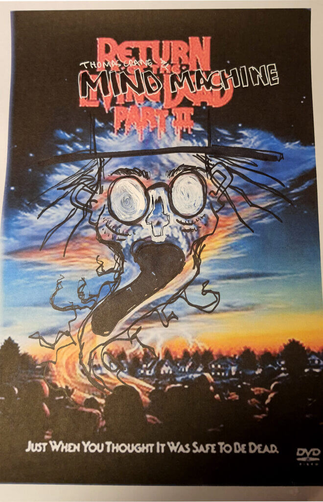
A classic movie poster, I was interested in reproducing something similar to this. But, after drawing over the middle image, it again seems to disconnect Wonderland from whomever it is that he is terrorizing. Although I really want to mould my cover around a classic movie poster like this, it doesn’t seem to work. Again, I sit with the image of a town, but I want it to be more personal. I want to connect Wonderland to Thomas…

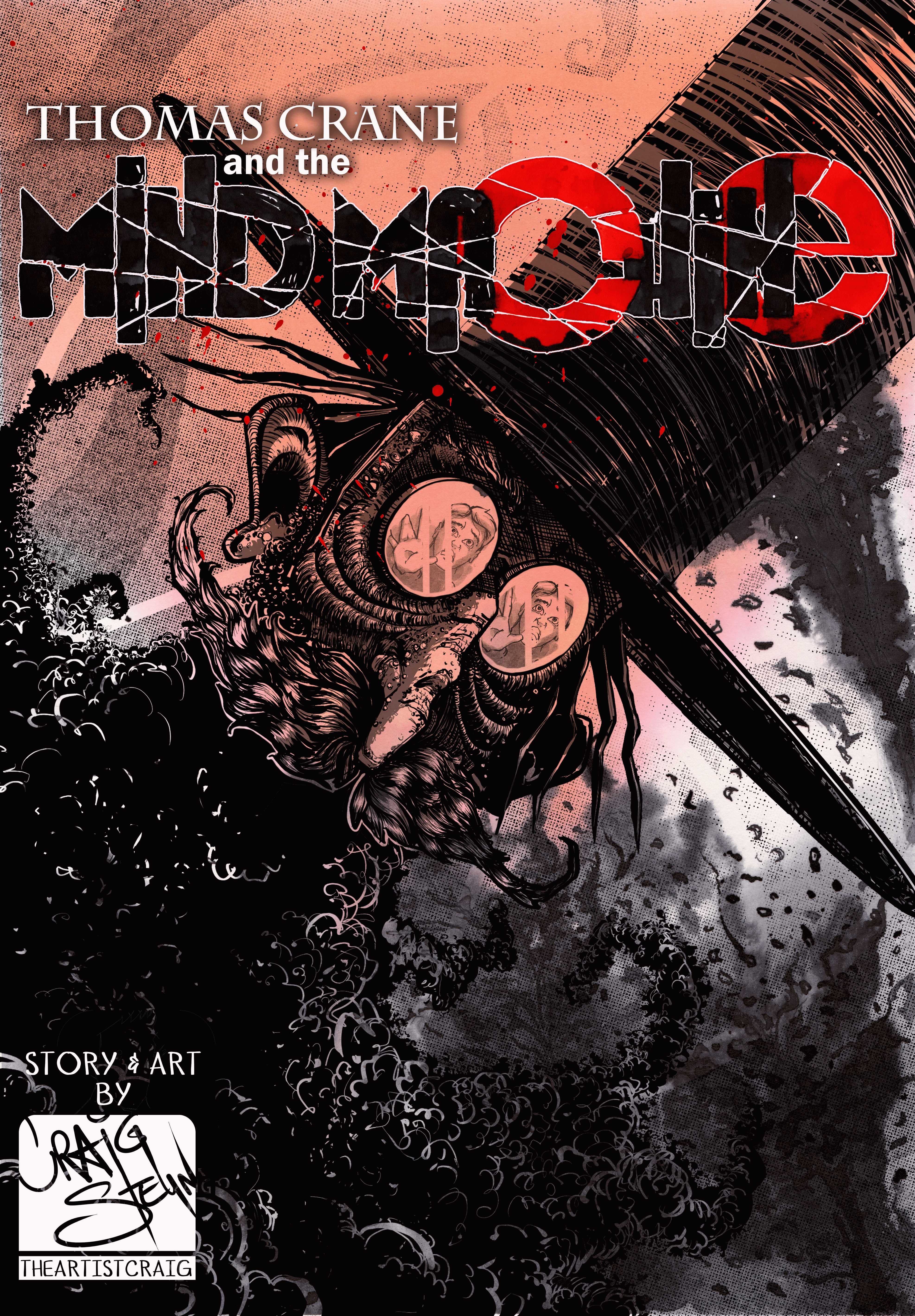
I definitely like this one. And it bring a lot of ideas to mind. I’m thinking of creating a reflection in Wonderlands glasses and have him kind of leaning over Thomas in a very imposing manner. I still want to use more multi media in the final piece so I think I’m going to experiment with ink and water. I intend to keep the font traditional as well and don’t want the two to clash. I’m not sure if the cover art will be digital or traditional yet, but I’m going to start with the ink because it will need to dry for scanning. During this time I’ll do the digital. I also want to add a couple of easter eggs on the cover that link back to Lovecraft and at the same time reveal something of Wonderland’s identity. 

My intention is to work with digital, ink, and possibly acrylic paint. I also want to test a collage out… that has nothing to do with any of the afore mentioned, the idea came into my head and seems like it’s not going to leave me alone until I try it. The collage will be an inked background with a digitally overlaid image that will make up the collage. As mentioned previously I want to try and stick to the red and black colours.
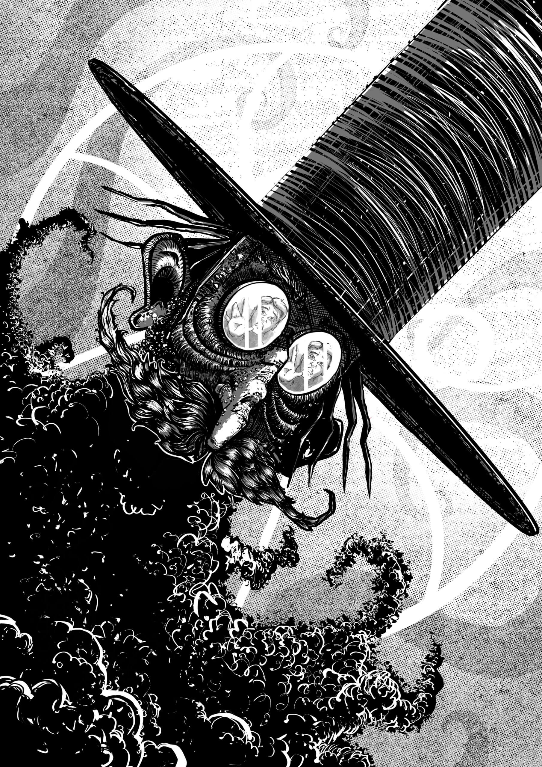
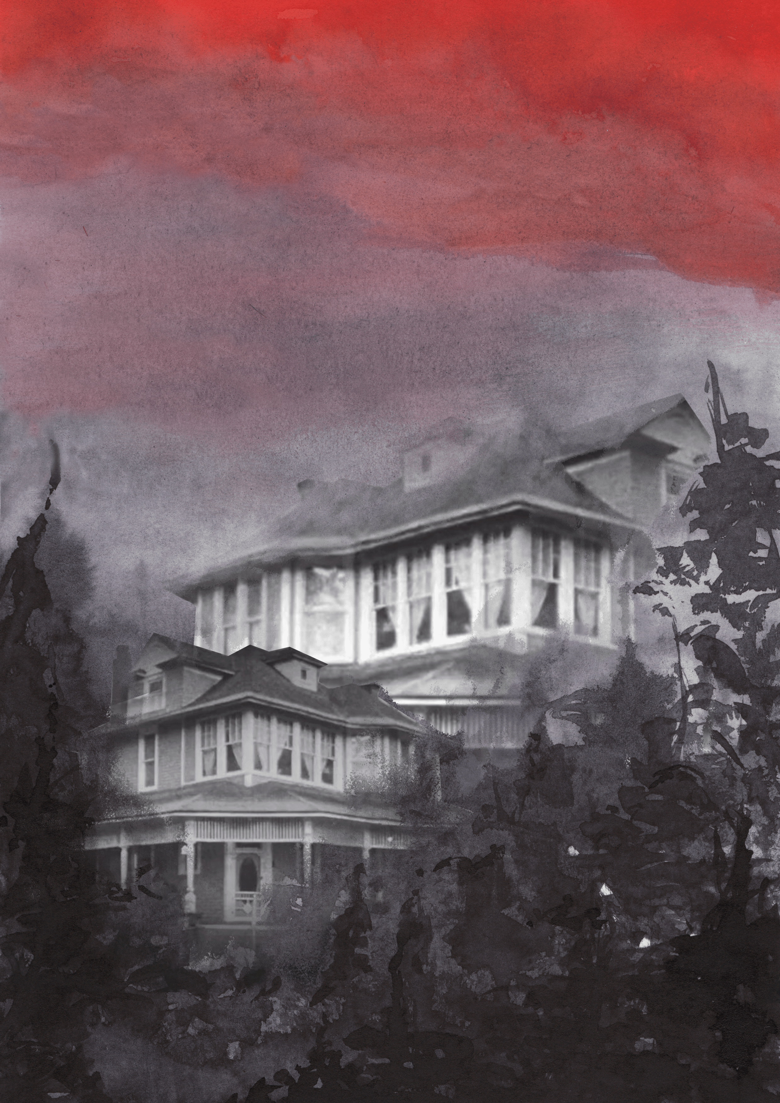
process videos of art making

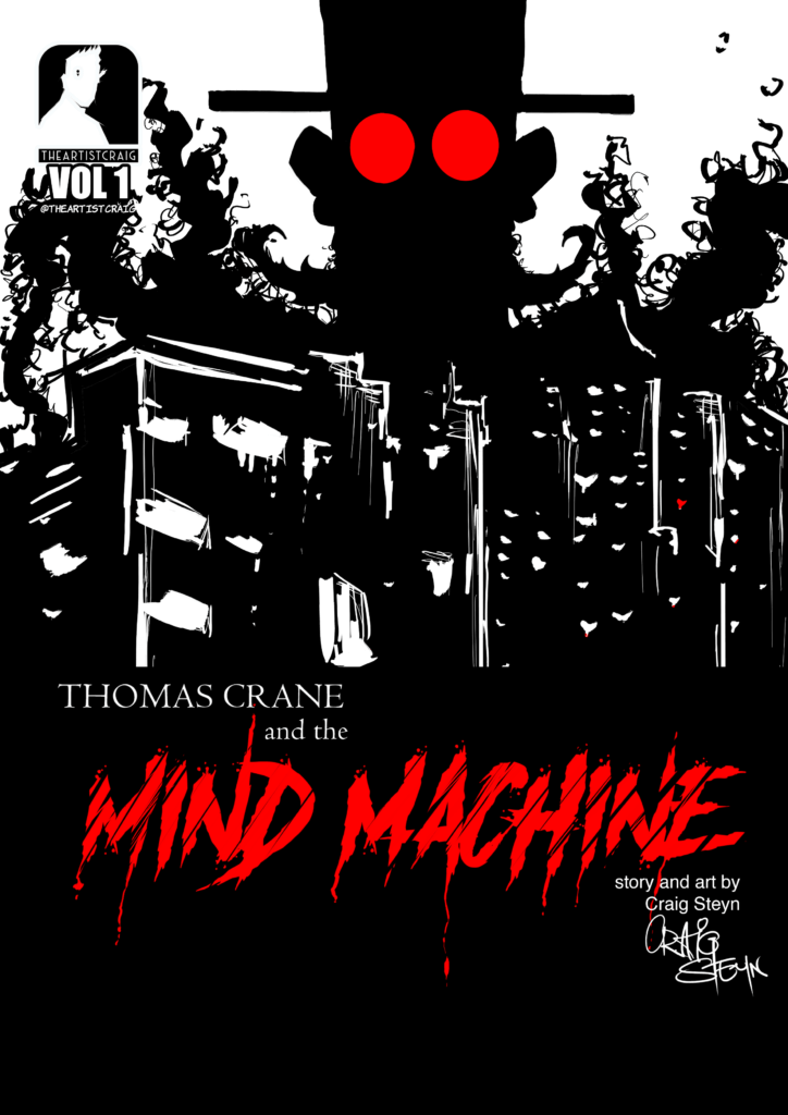
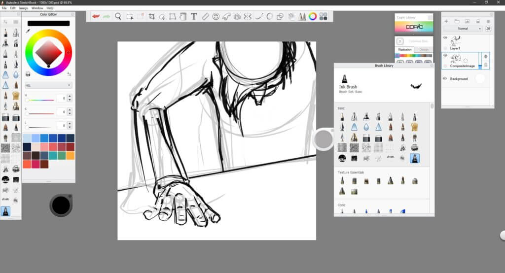
Using the layout of the last movie poster, I decided to draw Wonderland across the page in a similar manner, but to add some remnants of who he could be in the background. I also chose to do this fully digitally because in the previous issue I didn’t do much digital art, but used it as a secondary tool. Here I’m hoping to integrate the various mediums in a bigger way than before.

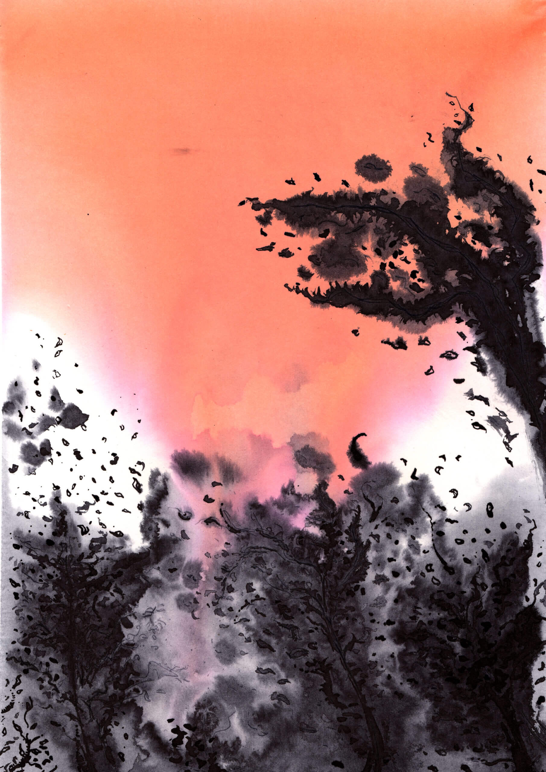
I was playing with possibility of creating a cover using ink washes and digital collage. For the most part I wanted the the ink to do it’s own thing and then just guide it here and there. I created the trees by layering wet on top of dry ink for depth and the I cut and pasted and worked an image I saw in a movie. The end result was more of a composite than a collage. Although it looked okay, it reminded me too much of the first cover.

Once again, the aim was to let the ink flow how it wanted to so that I could get a very organic feel to the back ground and the possibly work over it with digital. However when I was done, I found the black to be too harsh. I abandoned this one but, something interesting happened when I used my dip pen on the really wet paper. I explored this effect on the next piece that can be seen below captioned cover 3 (click “cover 3” to go to the image)

completed cover artworks

cover title font

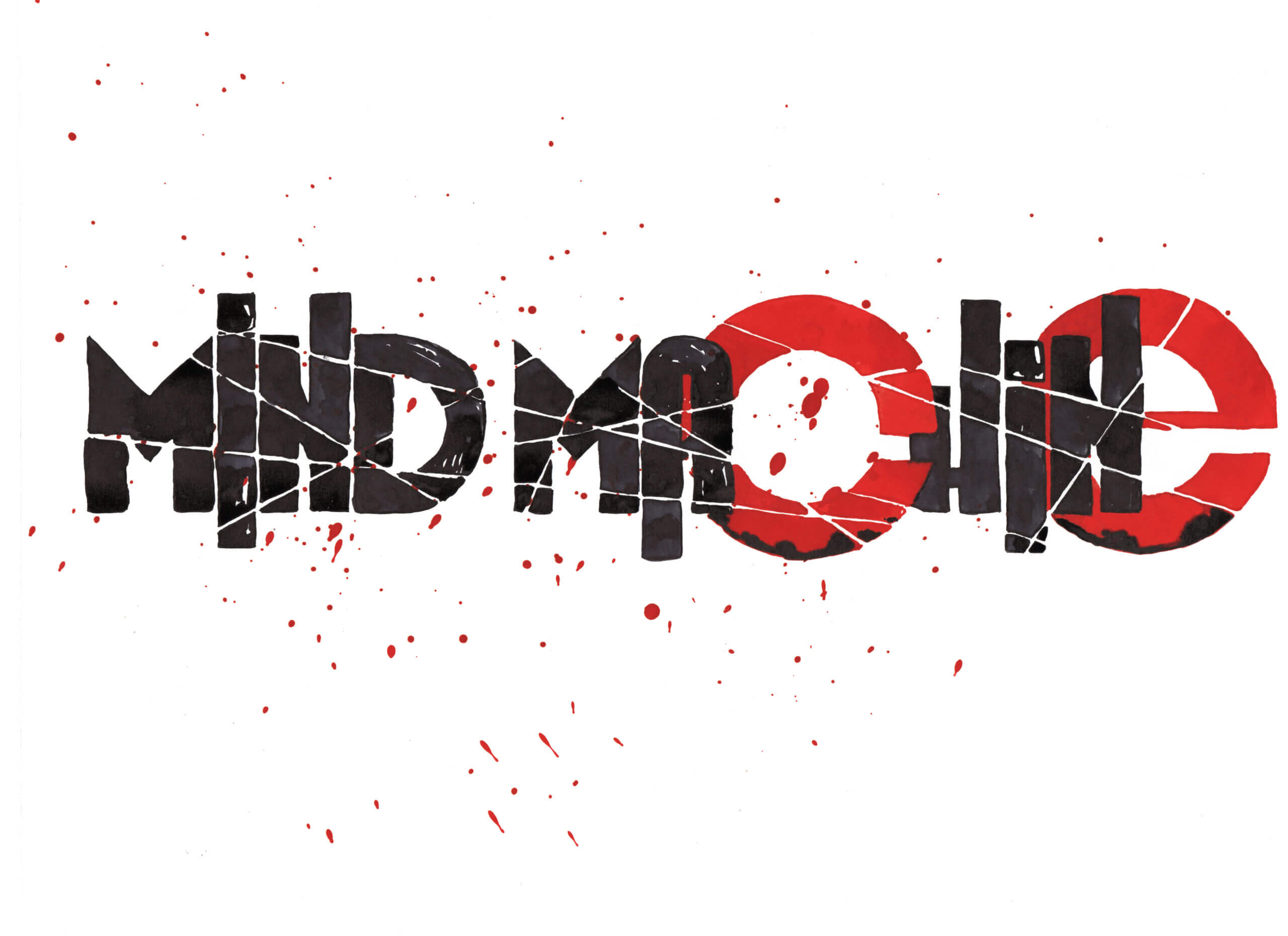
Out of all the title fonts I saw on the movie posters, this is the one that eventually made the most sense to me. The slab lettering is bold and the fracture line to me is representative of a broken psyche or a fractured mind. I eventually ended up using it, but experimented with a few other fonts first, trying to achieve this imbalanced and broken feeling.  

Something I also really wanted to get across is this feeling of nostalgia. Reason for this is, it’s such a “nowhere” feeling…

can adding nostalgic images increase the sense of melancholy or insignificance that is so common of a Lovecraftian horror? The story must end unresolved, but I want to create some attachment to it.
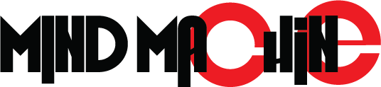
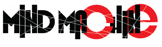
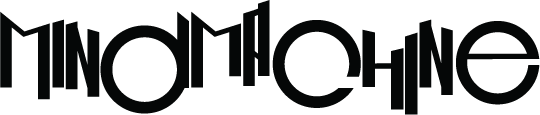
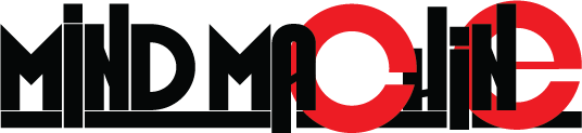
This being the title font I eventually used. Using a grotesque font mixed with some geometric fonts to create a contrast. The variation in the heights of the ascender and descenders are to add to the sense of confusion and chaos amidst the symmetry. I used the “c” and “e” to repeat the motif of Wonderlands glasses, something that should eventually become recognisable.

I wanted to contrast the digital imagery with traditional media for the fonts. I wanted some of the accidents and textures that occur from using traditional media. I created a printout template and then used it on a lightbox on non bleed paper. I created two variations of the font and opted for the more dramatic one. 

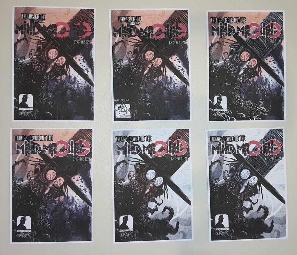
I used one of the previous cover experiments as a background for the digital drawing, it created a very pleasing gradient that made the image more dramatic. I applied a multiply blend mode on the digital image to remove the white layer and allow the bottom layer to come through. Then I cut the white background of the scanned image off the title layer by using the select, colour range in photoshop. I created variations of the how I would use the inked background layer and printed them all out so I could see them side by side and then decide which worked the best for me.  

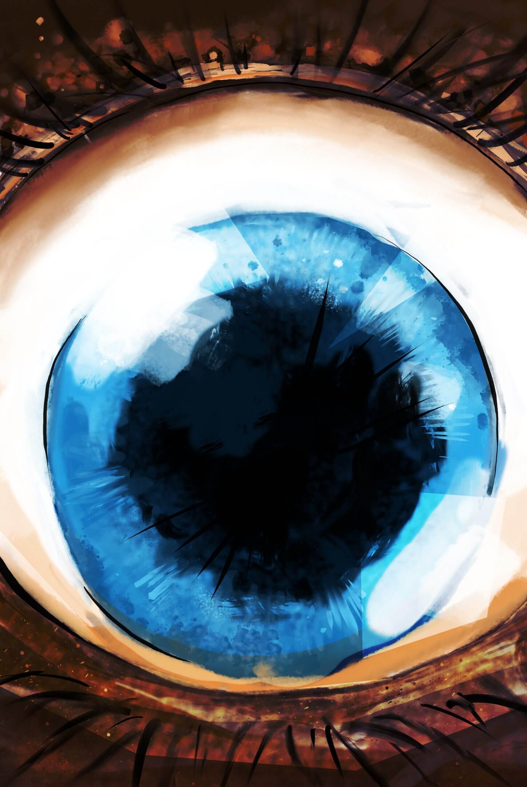
Considering what makes a good cover, I had to keep the basic elements, line, colour, form, texture and space in mind. To ensure my cover would stand out if it was on a shelf, also I wanted to hearken back to the silver age of comic book covers (nostalgia) by giving the reader a sneak peak of what they’re going to find inside. The idea is that the possible reader sees the cover and asks themselves “what’s happening here?” But, as mentioned in the beginning, it has to comply with two things: Be a standalone piece of art, which I believe I accomplished through the use of various multi media and tell it’s own story. The reflection in Wonderlands eyes tell the story of someone being afflicted by him. 

The first story was much easier to write. I’m still wrestling with so many different narratives. Previously, the objective was to leave the reader in limbo and have them finish the story themselves. I don’t want to compromise that feeling of unanswered questions, but I want to build on this story in a way that it gives some clarity to the previous one

the Story

story brain dump

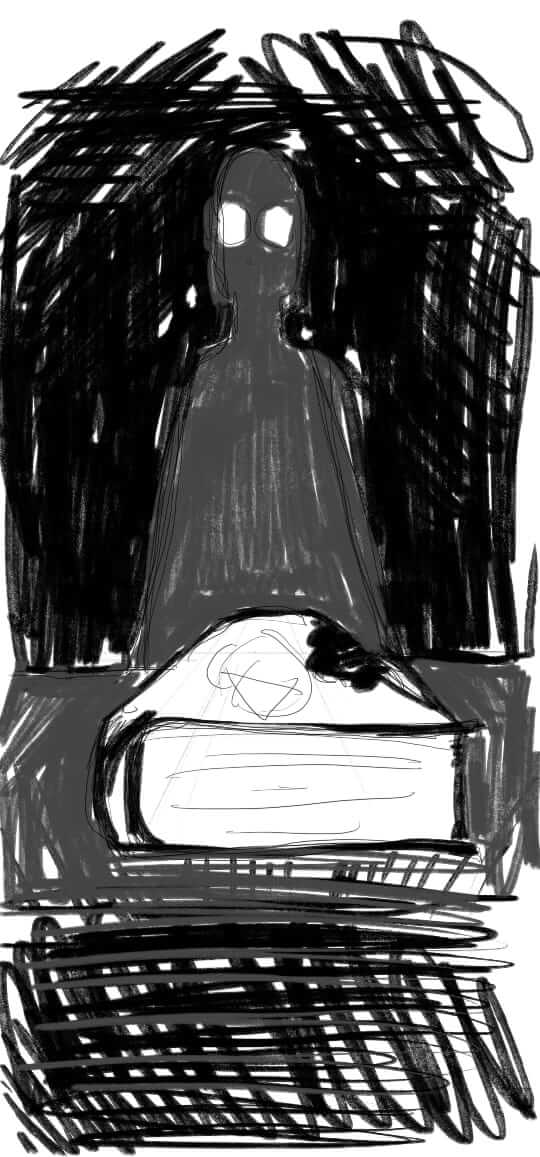
Before I start writing anything… I spend time just making rough drawings and thumbnails of elements I want to see in the final story. Almost like a “story board” but none of this is in sequence… It’s just the ideas that come to mind.

This video is a quick reflection on the GAR contact session as well as thoughts on some devices I intend on using moving forward. More specifically the panel layout and the colour palette. Also, the direction the story is going in.   
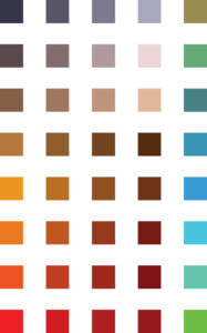
Also, what was mentioned during the contact session is how am I planning to progress from this point on. From here I believe I’m going to move onto the storyboard… I know, where’s the story? I’ll explain then. And then the story and character sheets. That’s how I “assume” it’s going to go.

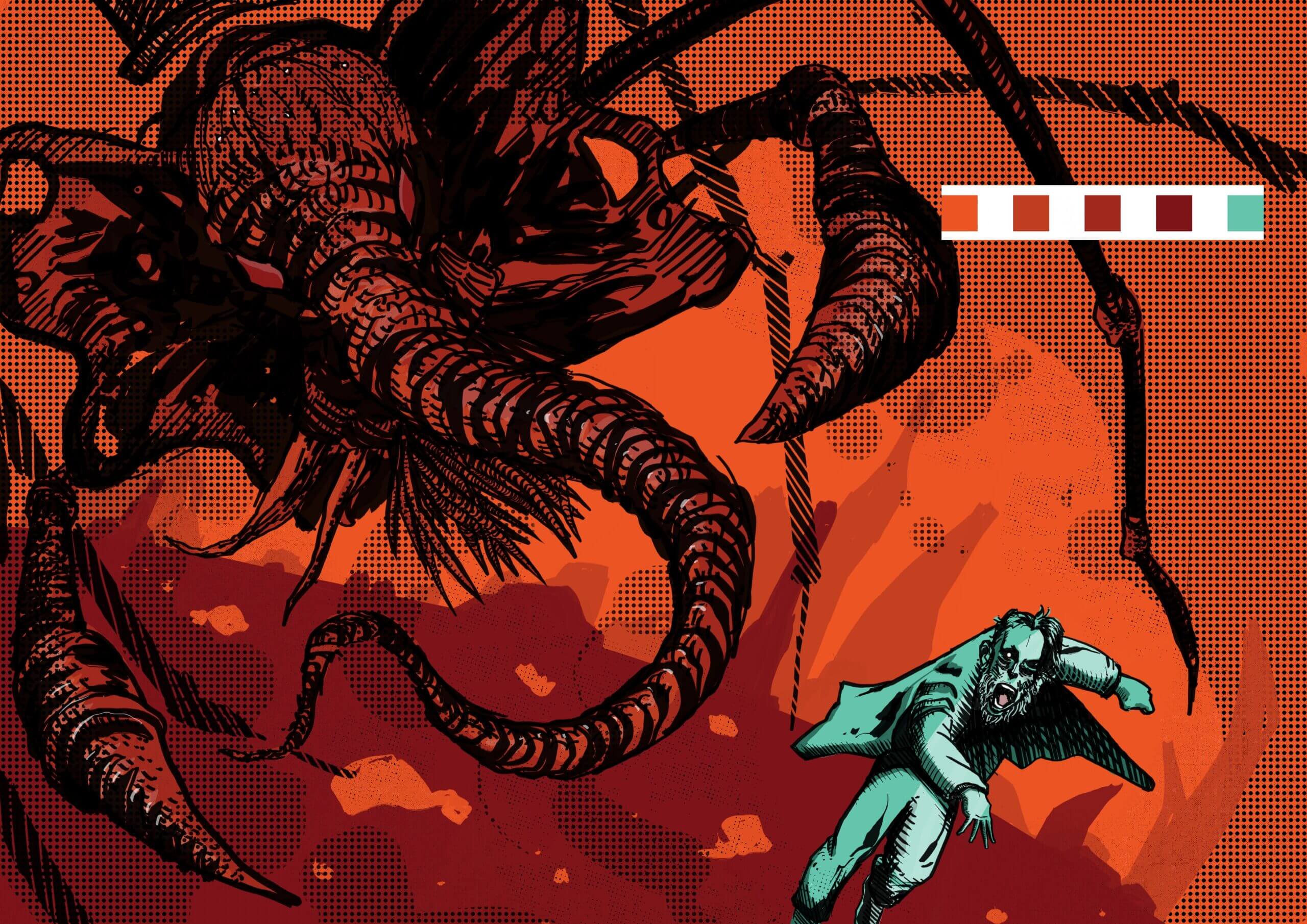
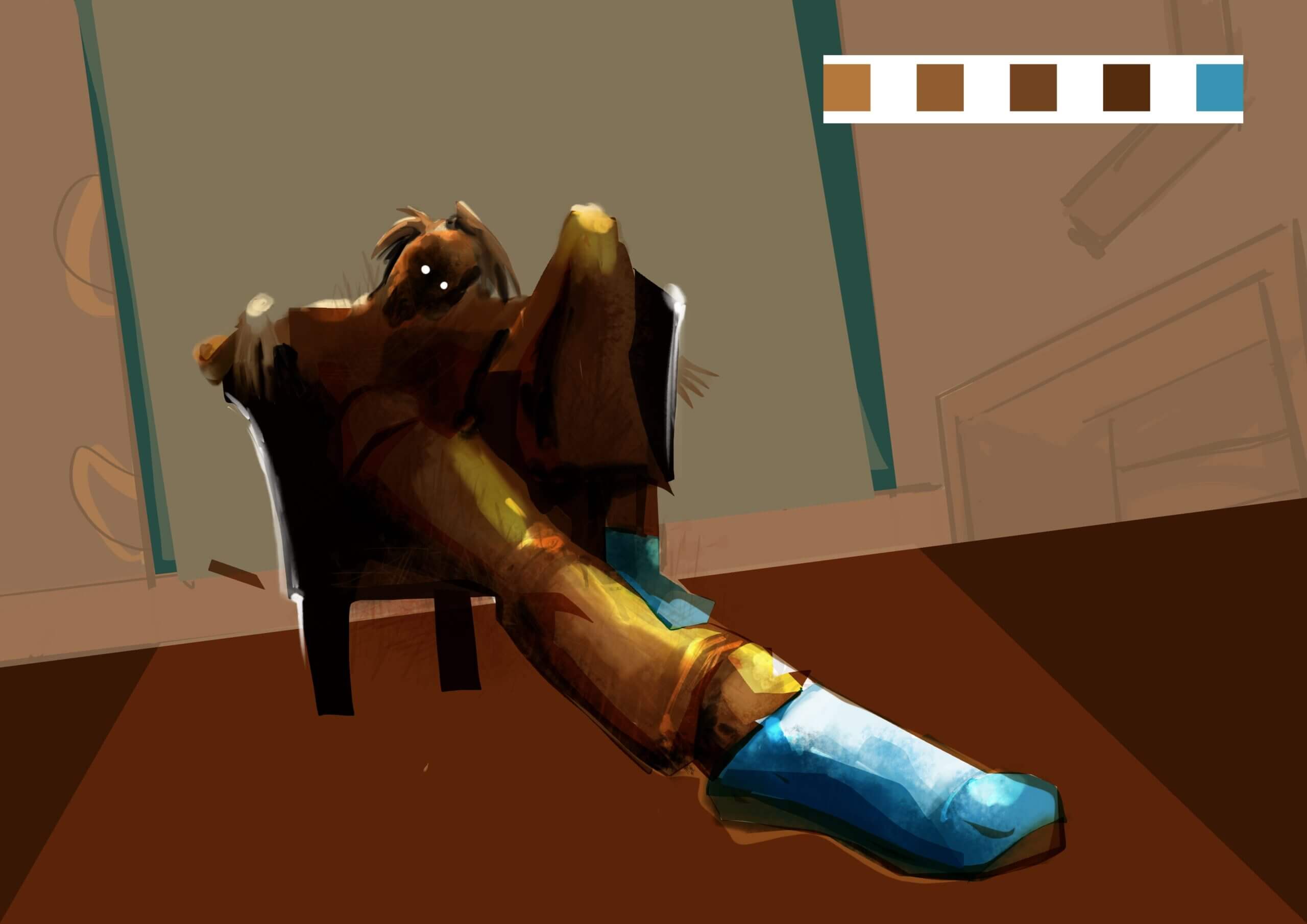
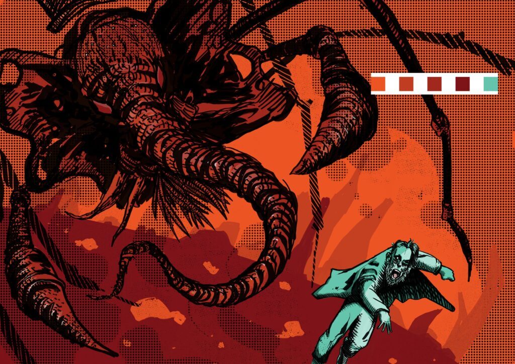
I quickly put this colour palette together in illustrator, This is the very basics of how I would want it look per page. I have the gradient moving from cold to warmer colours, with the main colours being the swatches on the furthest left. Moving the to the right, I have mid tones and a complementary colour on the furthest right, to bring attention to certain elements within a panel or page. I will adjust the tints and shades according to what I need in the panel. For now, this is what I want. After I’ve done a few pages I’ll know if I’m going to continue with this, it’s quite possible that a few things will change once I see it on screen per page. 

My biggest gripe with digital colour is the lack of texture that often leaves the image looking flat and bland. Even though I used various shades, tints and lines to create textures and contrasts. . . it still looks flat. I might have to adopt a more painterly style and see how it works with the line art. I could completely remove the line art and use a traditional painting method of layering digital paint… but then I won’t be able to do the thing I love doing the most… line on lines on lines. The halftone has to be scaled down much more and I need more contrast in depth. Possibly being bolder with the shadow and highlights, it’s because of the line art that I’m a bit more apprehensive when it comes to blocking out big parts of detail. But, on the flip side, because I’m referencing paintings I’m trying to do it in a style far removed from painting.

I created the brushes, I did a bit of research… and I tried. To be honest, this style didn’t do it for me. I got frustrated because it’s going to take some time for me to acquire the level of skill I need to depict the kind of images I want. So for now, the painterly style is going on the shelf. I will explore it further another time. That still leaves me with the same problem of the image looking flat.  

I can try and mix a hard graphic style and overlay some painterly elements on it and see if the layering of colours on a multiply or screen filter can add depth and texture. The goal is not to lose the graphic element and to bring the line work out.
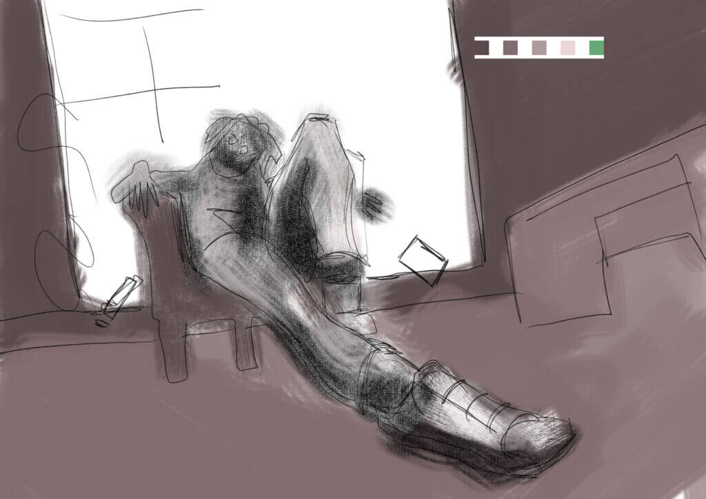
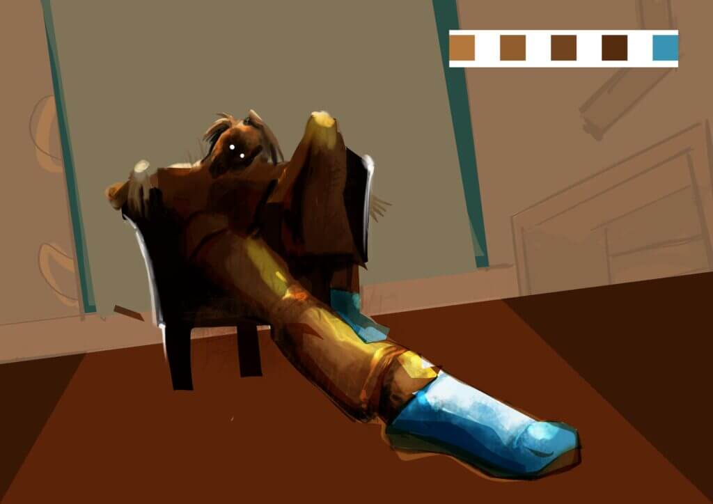
After struggling to focus on just one plot, I decided to have a friend question me on a few aspects of the previous volume and see what direction the next one is going. What was evident when I reviewed this video, is that I had no idea where I was really going with this. This video prompted me to ask some serious questions and make some final decisions in the story. After this I consciously decided to not follow some plot lines in my thought process and to drive my art away from that direction. I also decided to not focus on the nightmare state for now but, the connection to two worlds will be there…even though it wont be so obvious.
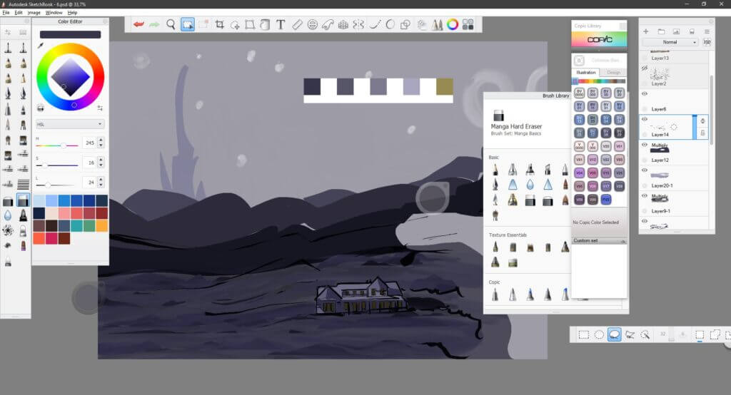
HALT! thine horses!

The next part of the website contains all the thought that went into the final piece. The structure of the information in the next section is placed according to how it came to me. A lot of the actual narrative and dialogue comes to me while I’m drawing, so the next section will act as a notebook. A lot of the story will be revealed here however, my intention is still that the reader explores all the imagery in the panels to guide him or her in a process of drawing their own conclusions first. For this reason I would like you, the reader, to first read the graphic novel. Give it some thought and then come back to this section. For this reason I have created this handy dandy “Take me past the spoilers” button… one click and all your problems are solved. . .

the notes...

I’ll try and explain this section as best as I can. Once I start drawing the actual pages, I start thinking about the story. What influences the story from this point onwards can be anything, if it fits the genre. This section will contain all those notes, it wont be that curated, so it might seem a mess and very random. So it can probably be seen as a very large mind map of sorts. I will still try and make the source of influence known or what the specific piece of information is related to through icons or short descriptions.

the music...

I’m always listening to music while I’m drawing and thinking and a lot of it makes it onto my pages. A lot of my drawing in itself is me trying to interpret the emotion being transferred in music. I listen to music that is suited to what I’m trying to draw and it’s a big part of my work flow. For this reason I will try and link a short playlist to this section, but because I don’t want to stop the workflow in wont be very concise. At times I will listen to a single song on repeat if it’s helping me to conjure up the right images. And as with most meditative processes, the more I listen to that specific track, the further it takes the story. I will be doing this project an injustice if don’t mention this influence in my work.

But Thomas…

…let’s be clear about this

we’ve been over it a hundred times before

there is no other reality. What you see in front of you is the only truth. 


you know this.

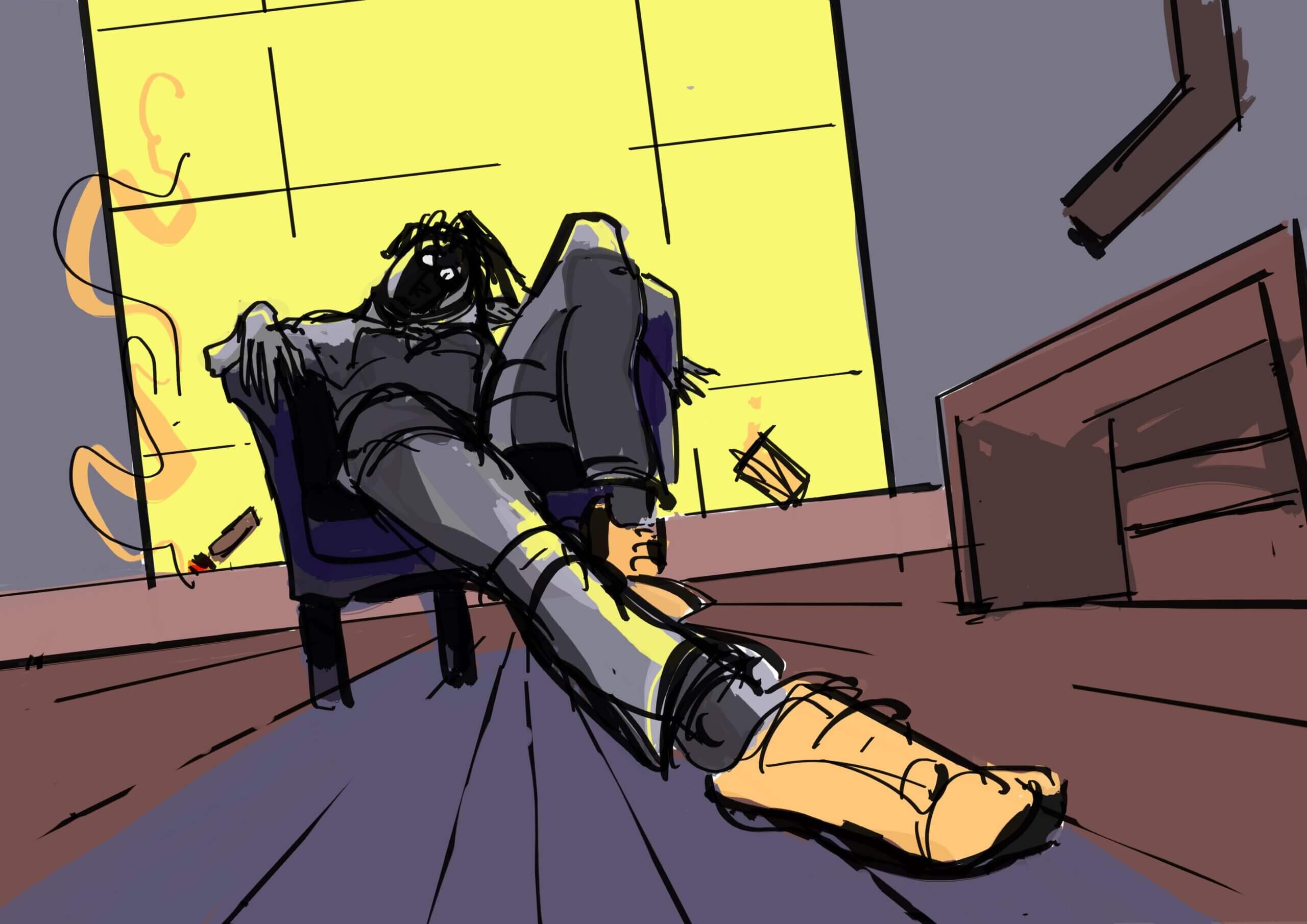
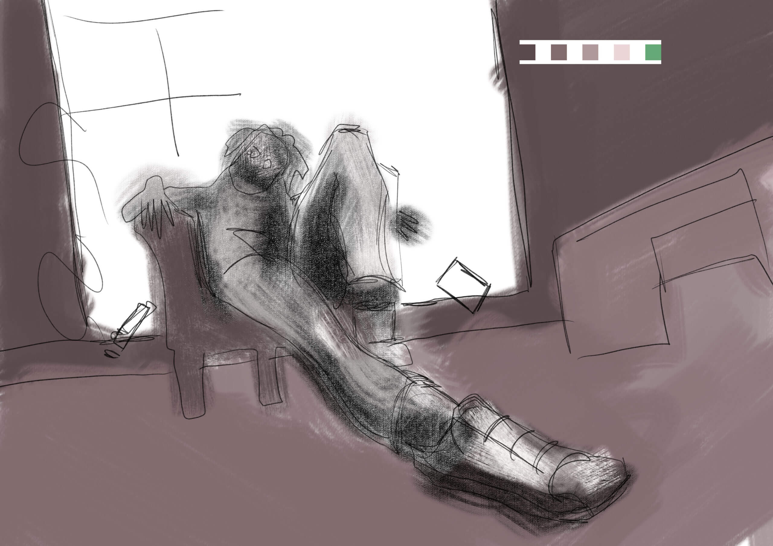
Thomas is sitting in a psychiatrist chair

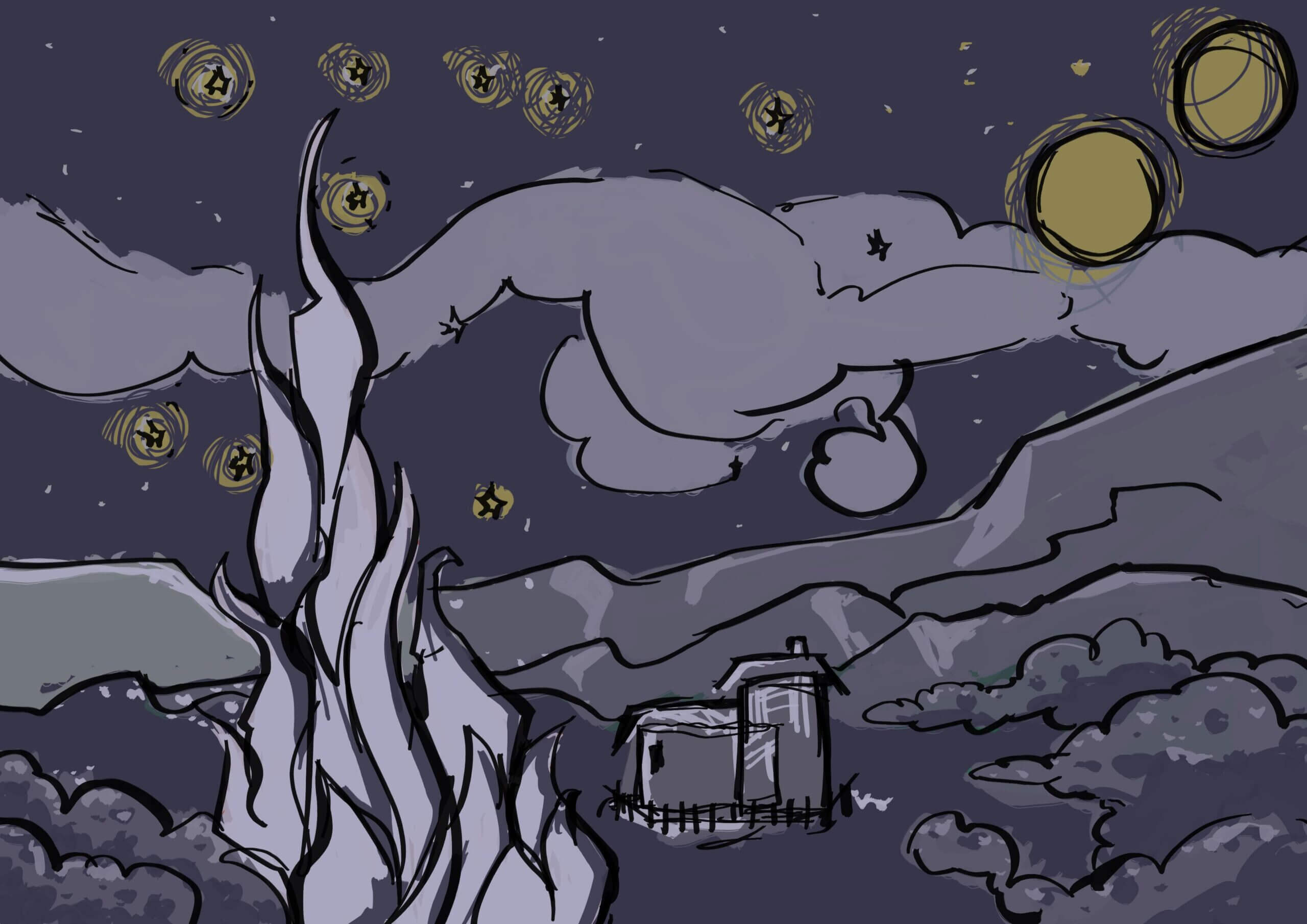
behind the starry night, original optimistic landscape, panel shows the other side of the painting, and in contrast the unhappy landscape, desolate and void of colour.

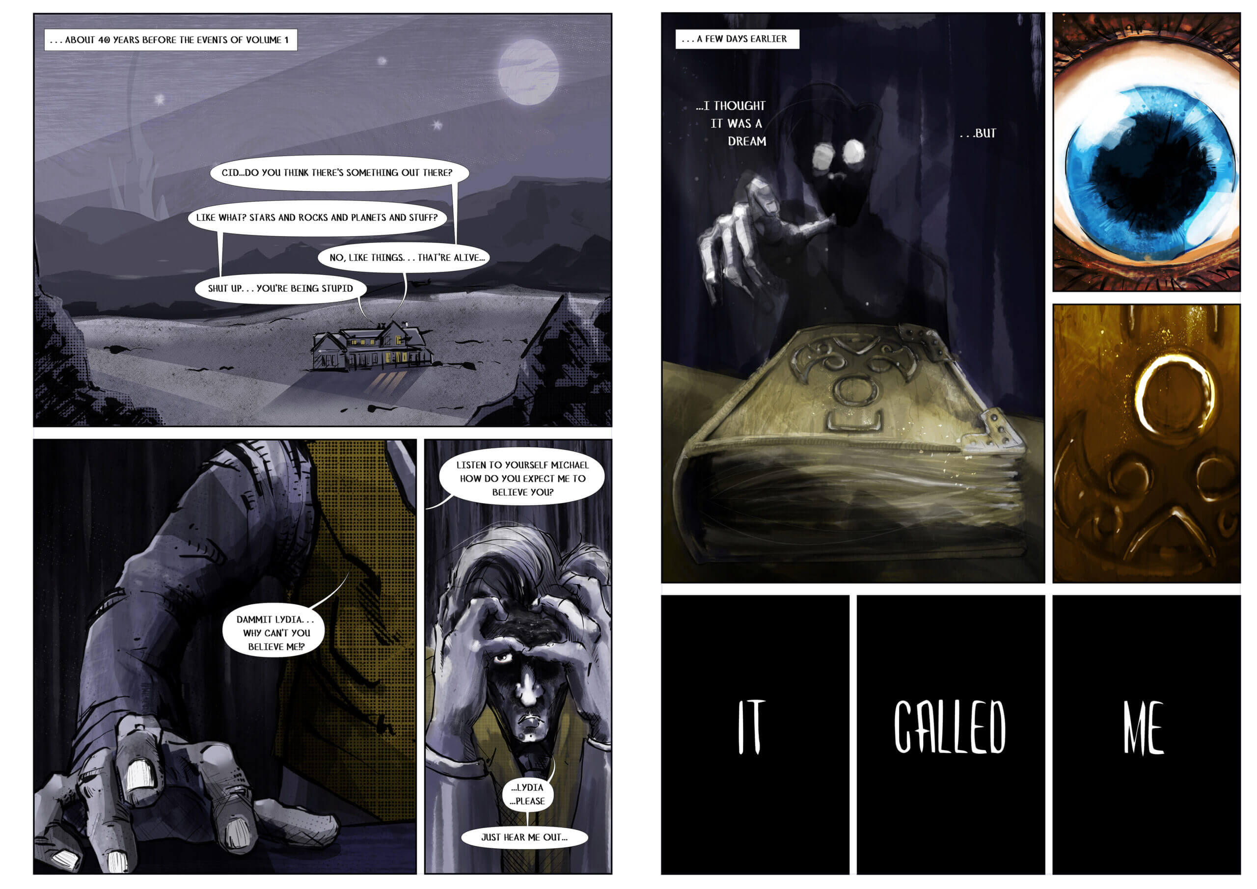
“Do you think there’s something out there Cid?”

“like what? Stars and rocks and planets and stuff?”

“No, like things… that are alive…”

“Shut up… you’re being stupid…”

“Dammit Martha! why can’t you believe me!

“Listen to yourself Michael, how do you expect me to believe you?”

“…Martha… please…”

“…just hear me out.”

dammit martha rough
dammit Lydia complete
I ended up painting anyway...
the planned page
the completed page

conversation between the two boys.

distortion of the time line


a few music playlists

The Final Product

the end... of this volume

the artwork

the book

the pages... explained

Although I want the reader to draw their own conclusions by making links between volume one and two, there might be some aspects that slip by unnoticed. So the following section will be an explanation on what is going on in the pages and then the story behind what is read. However, I would encourage the reader to try and make more connections and draw their own conclusions as to what happens in the “unseen pages”

So… this is it then. All done. After I completed this project there are a few things I realised. Firstly, this novel hits a bit closer than I’d care to admit, but I guess that’s what happens when you let the art dictate the outcome. I’ve learned many things during the course of this project, but the biggest lesson for me must have been that I can’t force the project to be something it doesn’t want to be. The result, I find, tends to feel like something unauthentic and lifeless. The only way I will get to the outcome of the project is through continuous work, until the project starts creating itself and I can understand what it wants from me. This came to light when I heard the phrase “intuitive method”. This was by far the greatest takeaway for me during this project and realising the standard convention is not necessarily my standard convention.

Feel free to leave a comment, I appreciate any feedback!

Leave a Reply

Your email address will not be published. Required fields are marked *